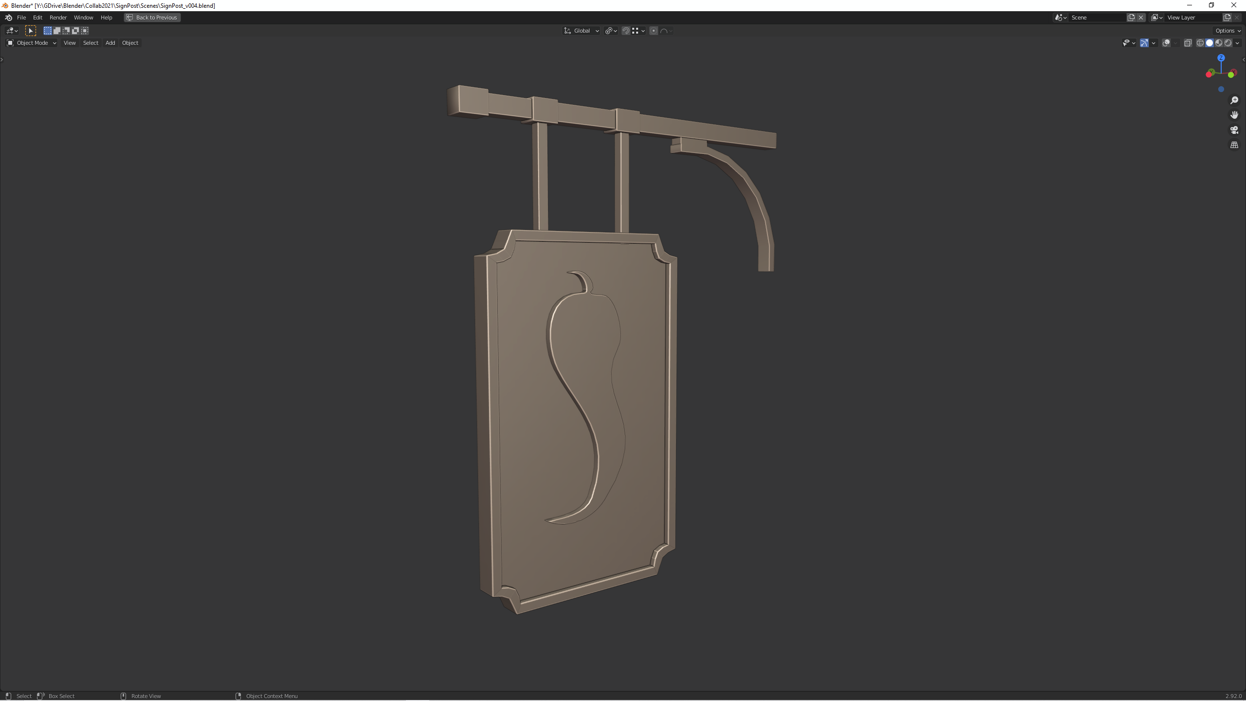
Homework Submission - Week 1 - Sign
@theluthier - have a look and see what ou think. I've followed the guidelines for this one, but I will add another post with an alt. version for you to look at. I wanted to challenge myself with something a bit different... it's good to have options :o)
Homework Submission - Week 1 - Sign - alt. version
@theluthier - this is quite far from the original concept, but I like the "shield" shaped sign more. maybe it can be a combination of the 2?
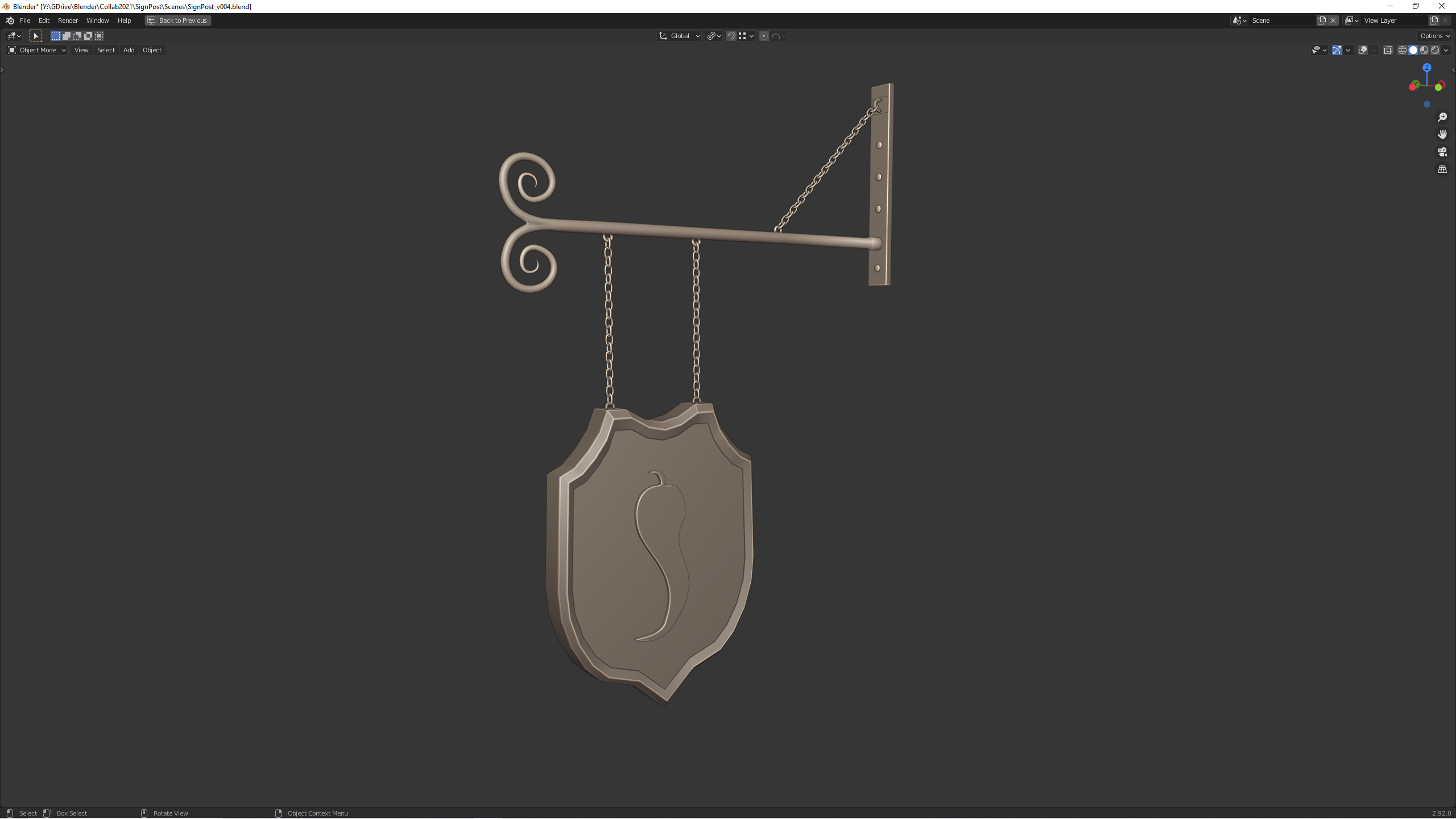
Beautiful alternative look of the spice vendor's shop sign 😀! I like the idea with the chains that allow the sign to swing in the wind 👍!
Looks good, nice alternative sign. I understand you want to make something different, to keep it interesting ;)
looking good ![]() jaivatur ! goes for both versions...
jaivatur ! goes for both versions...
: )
I for one actually prefer "the shield", viewed out of broader context... I'd need to see (and compare) both incorporated (in the whole) for any definite opinion; not to mention the "prime directive" ; )
Perfect blockout for week 1 ![]() jaivatur! You've earned full points + extra for the alt version 👍
jaivatur! You've earned full points + extra for the alt version 👍
I can't wait to see your sign sculpted with accents for week2. It's a very interesting concept to model a second, alt sign alongside the first? Is that your goal? If so it's a pretty cool way to immediately apply these skills in a unique way alongside the original.
Of course we'll need to use the version that matches the art since authenticity is a key theme for the whole project. But again, love the idea of the alt version as a creative outlet!
Congratulations, ![]() jaivatur , to the full plus extra points 👍! BTW, I've just seen that Vadim
jaivatur , to the full plus extra points 👍! BTW, I've just seen that Vadim ![]() harbinger_ua has a sign version with chains in his Pirates Tavern here.
harbinger_ua has a sign version with chains in his Pirates Tavern here.
thank you ![]() duerer ! Even though the "Spice captain" suggested to stick to the concept, I think I'll keep developing both further... just for the fun and to keep on challenging myself... Thanks for the support man!
duerer ! Even though the "Spice captain" suggested to stick to the concept, I think I'll keep developing both further... just for the fun and to keep on challenging myself... Thanks for the support man!
Hi @theluthier , I have been slammed with work, and been trying to catch up on this... I will put some work in tonight, and possibly tomorrow night... but I feel really behind.. I've basically just managed to sculpt the face of the sign so far. I'll try to catch up wth the sculpting over the next couple of nights and hopefully the texture over the weekend... but can't promise... I've managed to see half of the latest stream last night, and you mentioned week 4 is potentially for catching up if we are behind... I'll definitely need week 4 to do that! I'll keep you posted my Spice Lord!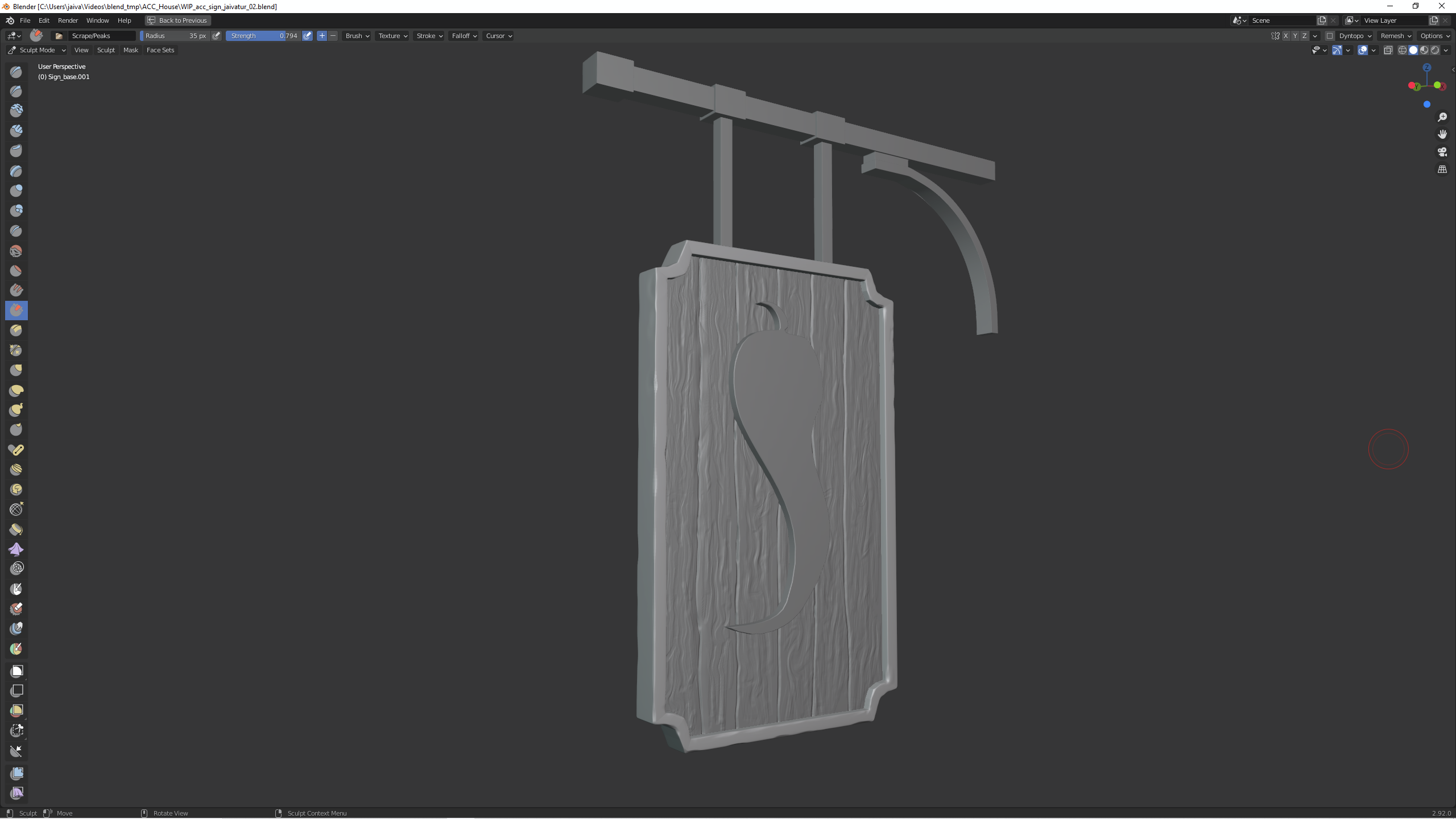
No worries ![]() jaivatur! Several people haven't finished sculpting yet. That's OK because week 4 is intended as a buffer for anyone that needs more time to finish.
jaivatur! Several people haven't finished sculpting yet. That's OK because week 4 is intended as a buffer for anyone that needs more time to finish.
I'm glad to see you've made progress with the sculpt though. It's looking good so far! One idea I had for the spice symbol was for a rough wood-carved look. Something like this:
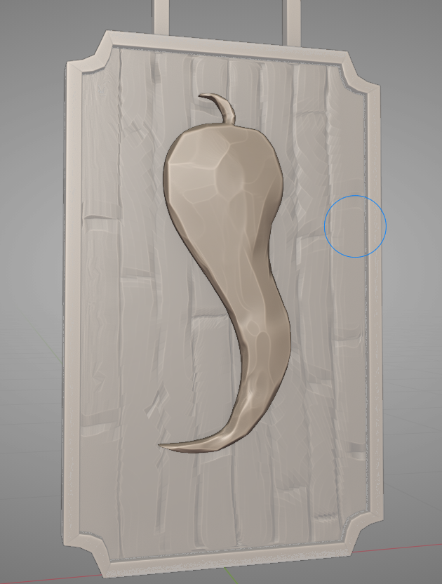
Meant to resemble this style:
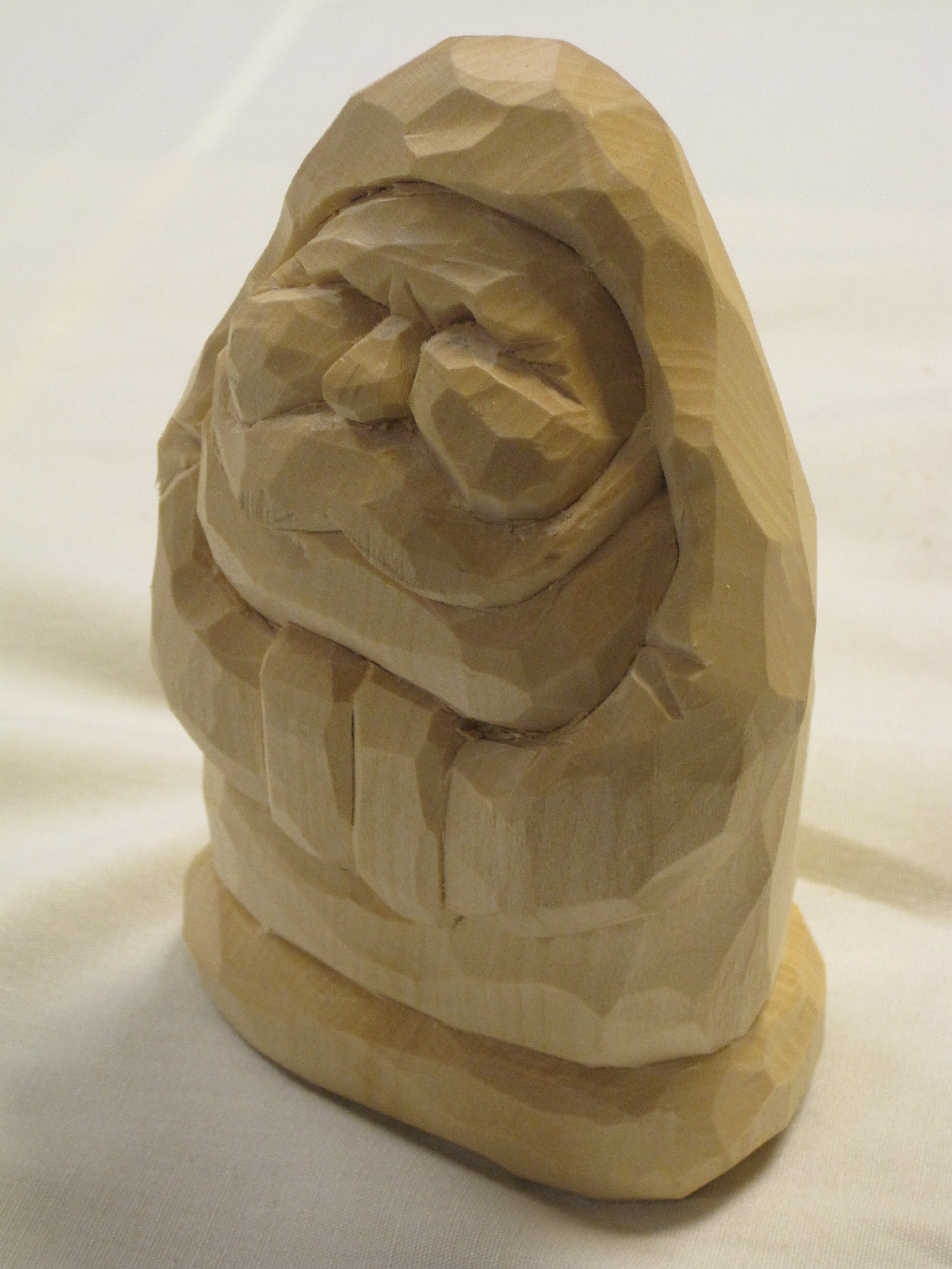
@theluthier Great idea! I'll implement that in my sculpting! Thanks!
@theluthier I don't feel pressured at all now! lol I'll do my best to get this done! Thanks mate!
@theluthier Finally I've managed to finish the sculpting for the sign... just a bit late :P I'm not 100% happy with the result though + the file is huge! 2.5GB - I think I went to town with the multires modifier.. It was just getting too steppy when sculpting, but then in the end I realized I was sculpting too smaller details that won't be really seen in such a small prop. One of the things I struggled the most is the pepper. I've tried to replicate what you've done with the c"carving", but couldn't really work out how to do it nicely. I assume you used the scrape brush, and it woked fine around the edges, but when I tried to use it in the middle of the pepper, being flat, wouldn't really work, so I tried to add some "bump" with tother brushes, like the inflate brush and then scrape it down. The result is not what I would have liked... feels quite "blobby". One thing I've learned is to use textures for sculpting, which is quite cool. After being frustrated with the pepper, I went to do the metal, and I watched again your video to see that you were using a procedural texture. So I tried to get some wood images and turned into BW and used them as texture in the draw brush. I was pretty happy with the result. I think I will re-do it though... If you have any suggestions, please fire away...
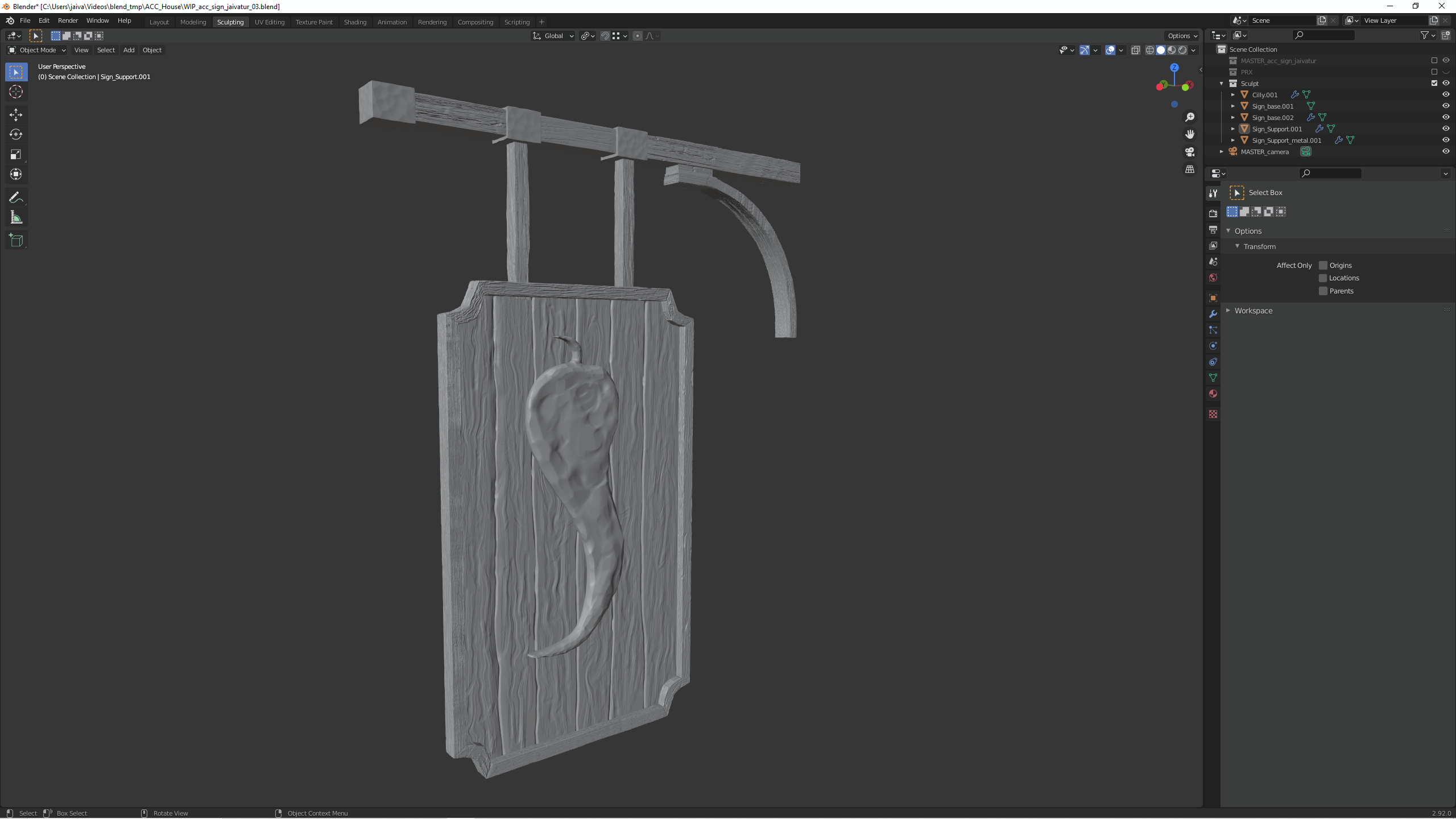
Looks good ![]() jaivatur! The pepper gets pretty close to a carved pepper look. My only suggestion would be broader scraped areas. Each scraped plane you have is a pretty small area which starts to look a bit like hammered metal. If you want to take a pass at broadening the scraped facets I think it would help.
jaivatur! The pepper gets pretty close to a carved pepper look. My only suggestion would be broader scraped areas. Each scraped plane you have is a pretty small area which starts to look a bit like hammered metal. If you want to take a pass at broadening the scraped facets I think it would help.
But even if you leave it the way it is the result will be nice. Keep up the good work!