@theluthier How did you align the camera (focal length?) with the artwork? If I get the vertical lines and the roof aligned, then it doesn't fit well at the bottom with the stairs and the mill wheel:
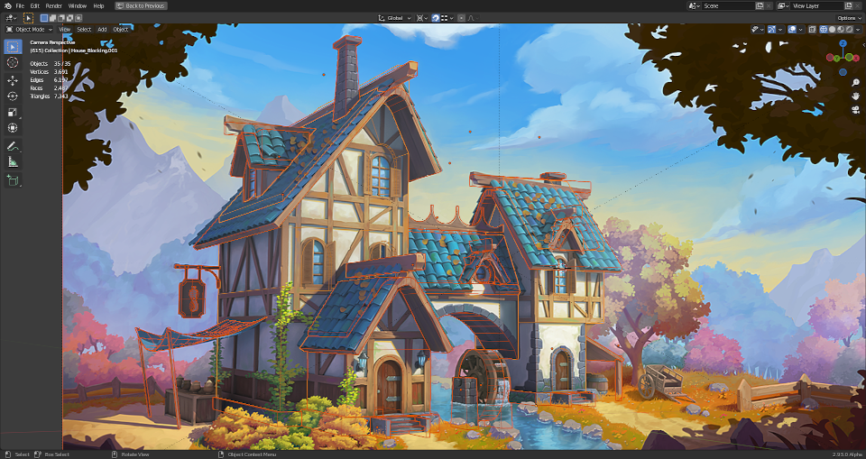
Furthermore, my house seems to be a little bit too strechted in side view:
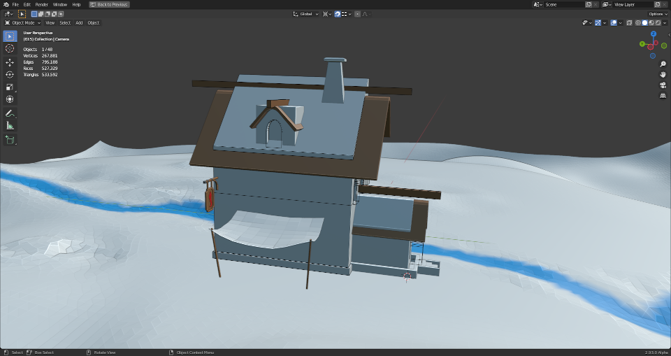
I know that it's a medieval style house and therefore it will never fit 100% with straight lines and 90 degrees angles but it should fit roughly . Slight changes in the camera angle already have a significant impact on the house's proportions! What are your reference lines and criterias for the best alignment?
One more question: Which scale should the house have?
Woah woah, you're encroaching on my plans for week 1's stream 😉
Honestly you're as closely aligned to the art as I was when I explored the house modeling. I gave up on getting it perfect and was content with being close. If the side feels stretched I would decrease the focal length. What is your camera's focal length btw?
Which scale should the house have?
We should aim for real-world scale imo. I've never really understood why a project would choose a consistent non-realworld scale...surely there's a good reason but realworld should work fine for us.
Note that I will be going over the house blockout in the first stream. Similar to the backhoe, if we all start from the same blockout then scale should be more intuitive for everyone to branch off and do their own models.
What is your camera's focal length btw?
My camera's focal length is 50 mm.
I think the house sides should only have around 75% of their current length in order to make them look as in the artwork.
PS: I've encountered an issue in Blender 2.93 with a blurry viewport:
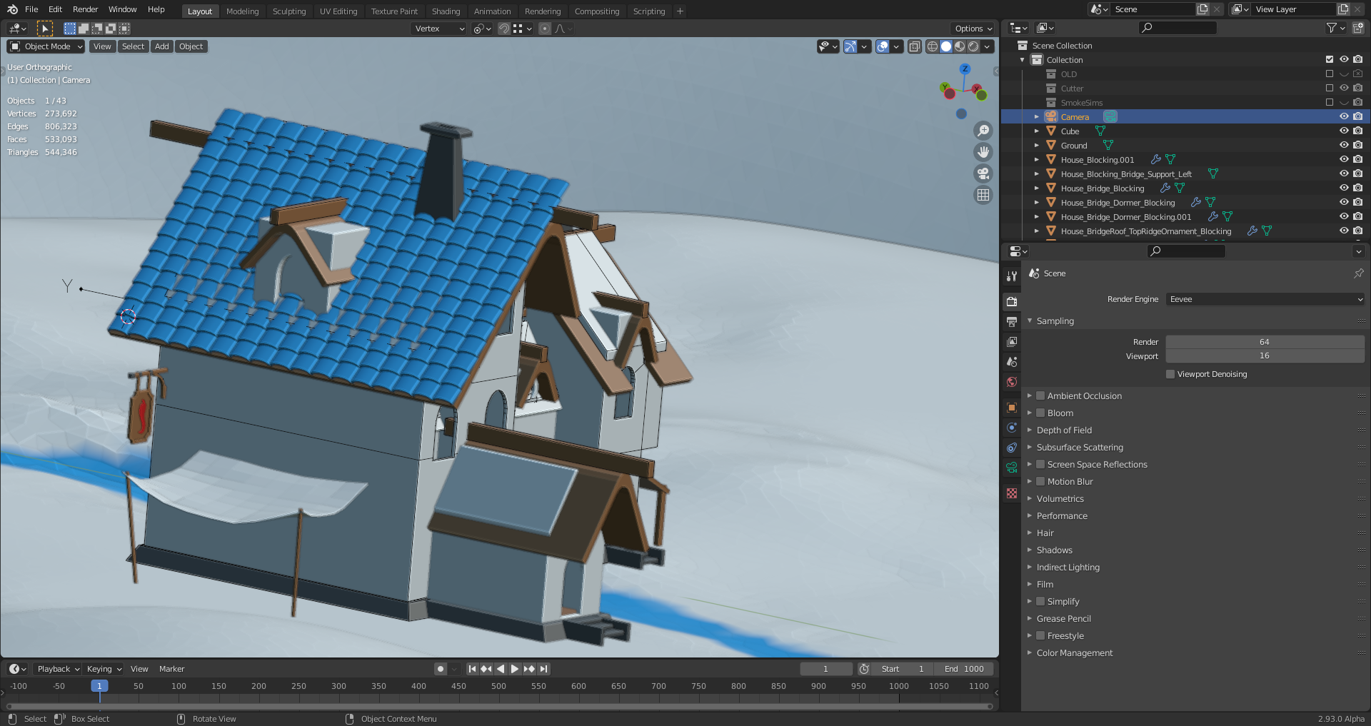
The problem is also described here.
If 50mm doesn't seem to fit quite right, I'd try 35 mm which is a common viewport default for 3D apps.
Also we could ask the artist since they used a 3D model blockout as a base to paint over! ![]() harbinger_ua could you tell us the focal length you used for your model of the spice vendor's house?
harbinger_ua could you tell us the focal length you used for your model of the spice vendor's house?
Oh wow it's finally happening! Super excited to see everyone's progress.
As for the focal length I used 33mm just to get a nice angle. It also equals 56 FoV if that's of any help.
Feel free to ask me any questions I'll try to help as much as I can. Although I have to state beforehand that I modeled it in 3d max (blasphemy I know) so I won't be able to share any blender specific info.
Thanks, Kent @theluthier and Vadim ![]() harbinger_ua, for your answers😀! I've (before reading your posts) used "fSpy" which calculated appromimately 40mm focal length and after importing the generated output file into Blender resulted in a focal length of approximately 33 mm (I don't know why it's imported like this):
harbinger_ua, for your answers😀! I've (before reading your posts) used "fSpy" which calculated appromimately 40mm focal length and after importing the generated output file into Blender resulted in a focal length of approximately 33 mm (I don't know why it's imported like this):
1) fSpy: The mill tower's entry door is set to a height of 2 meters (in order to make "fSpy" calculate the camera's distance)
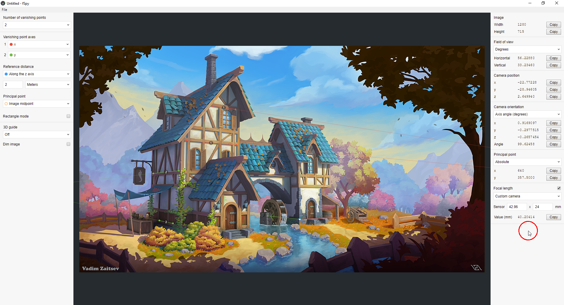
2) Imported into Blender:
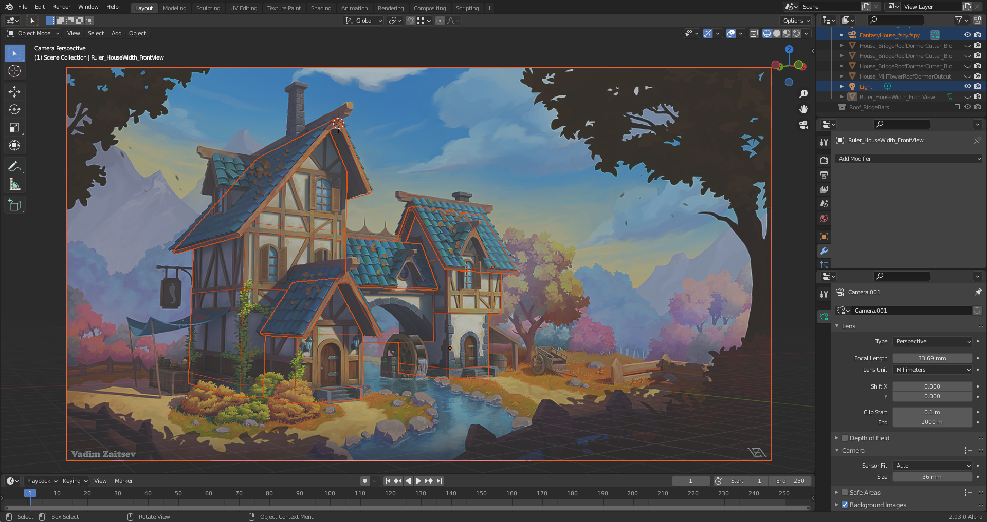
My "Fantasy House" modeled with 50 mm focal length resulting in a too long Y axis extension:
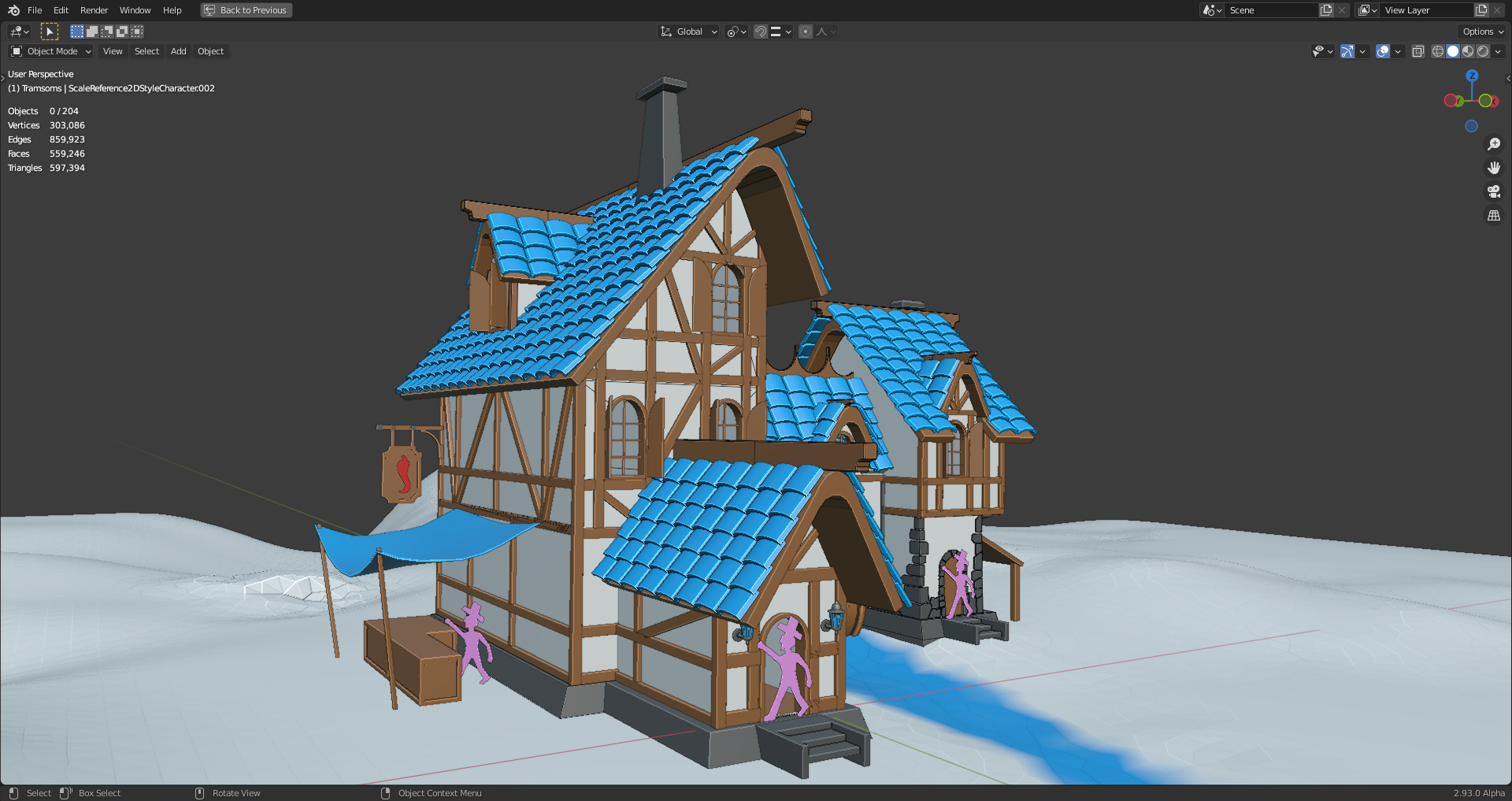
This dummy guy is 2 meters tall with hat.
Both models in a better side view (old with 50mm focal length and new with around 33mm focal length):
1) 50 mm focal length:
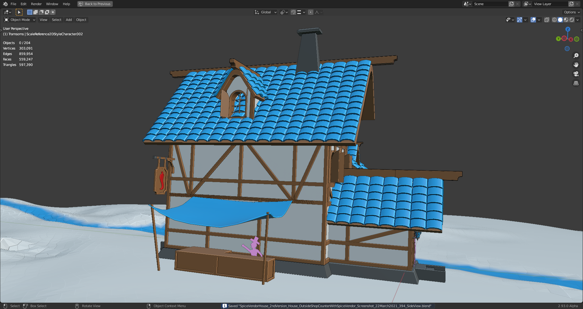
2) 33mm focal length:
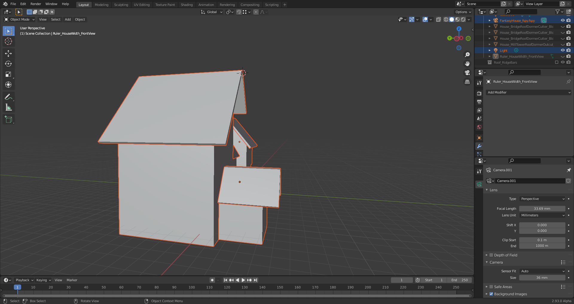
Comparing the camera angle and distance to the house in both versions:
1) 50 mm
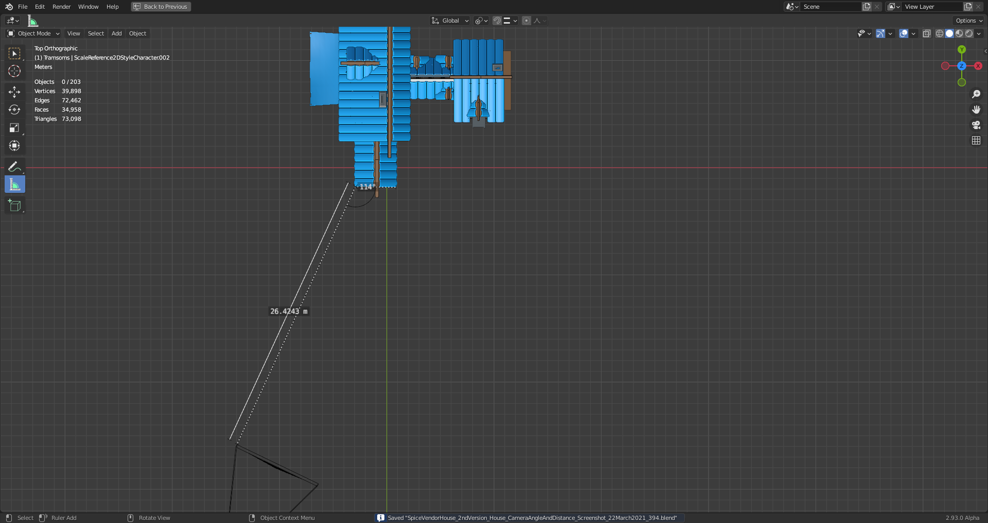
Camera rotation angles:
x: 93.1474°
y: -0.158732°
z: -25.7189°
2) 33mm
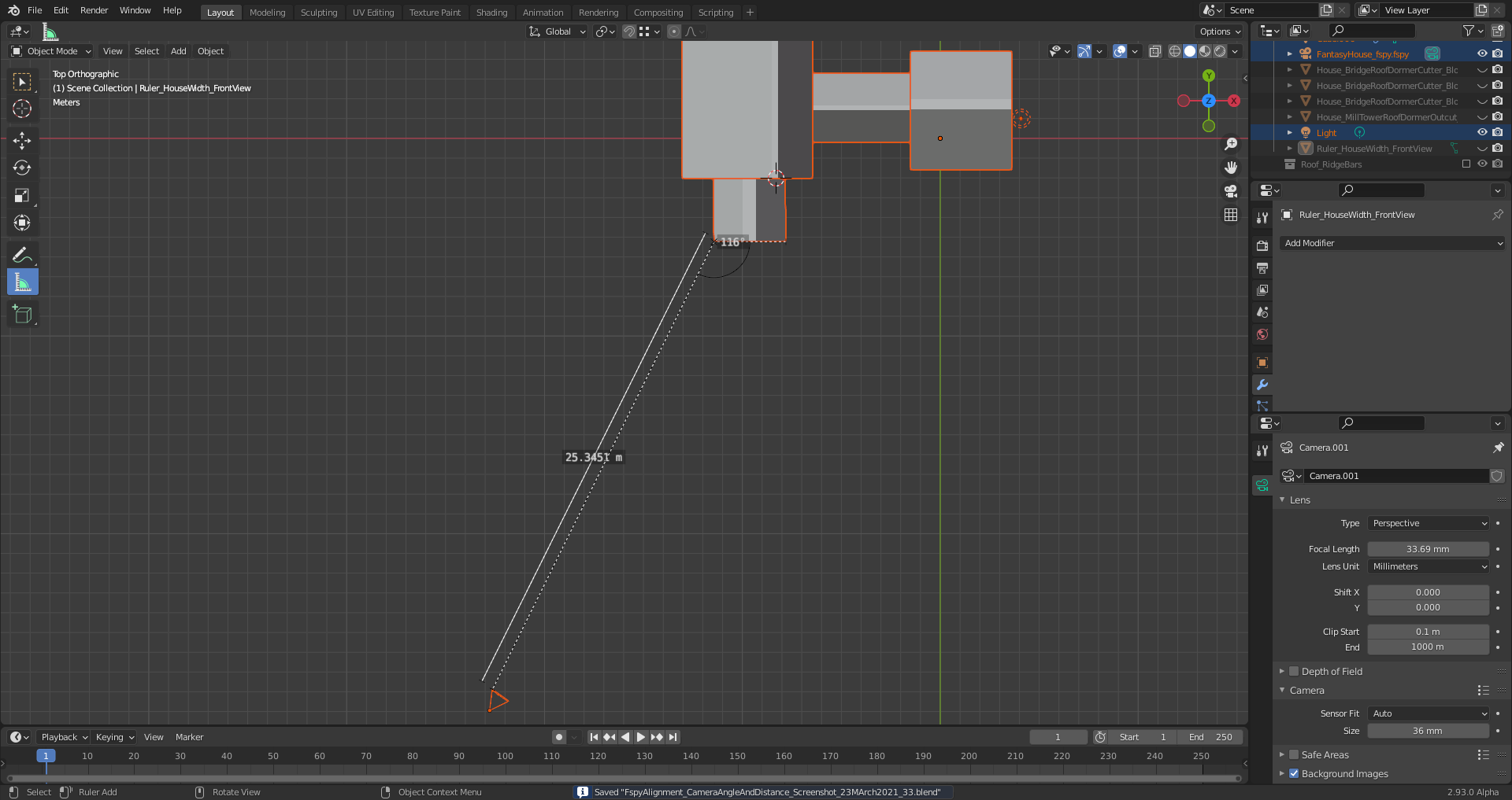
Camera rotation angles:
x: 94.8627°
y: -0.524676°
z: -35.4988°
Hi Ingmar, that fSpy add-on is very nice. I first saw it in Louis du Mont's https://cgcookie.com/tutorial/capturing-a-simple-environment-map-for-compositing-cg-elements and that got me interested in trying it out for this project as well.
My results were similar to yours. Although, the focal length value came out to 31.14 mm in my experiment. I have only started the block-out phase, but the cubes seem to be lining up very nicely.
I like how you were able to set the height/scale of the doorway in fSpy. I will have to try that next.
![]() ullreym In this case here it's also possible to mark a third vanishing point. You get the appropriate setting by choosing "From 3rd vanishing point" in the dropdown menu for the calculation of the principal point (the locationwhere rays running straight through the center of the camera lens hit the film or sensor) which is usually the midpoint (geometrical center) of an uncropped and undistorted image:
ullreym In this case here it's also possible to mark a third vanishing point. You get the appropriate setting by choosing "From 3rd vanishing point" in the dropdown menu for the calculation of the principal point (the locationwhere rays running straight through the center of the camera lens hit the film or sensor) which is usually the midpoint (geometrical center) of an uncropped and undistorted image:
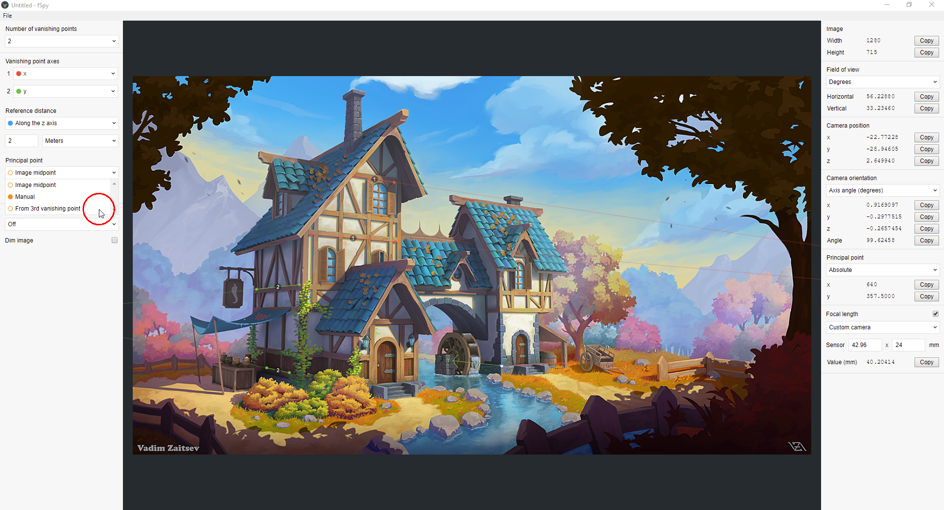
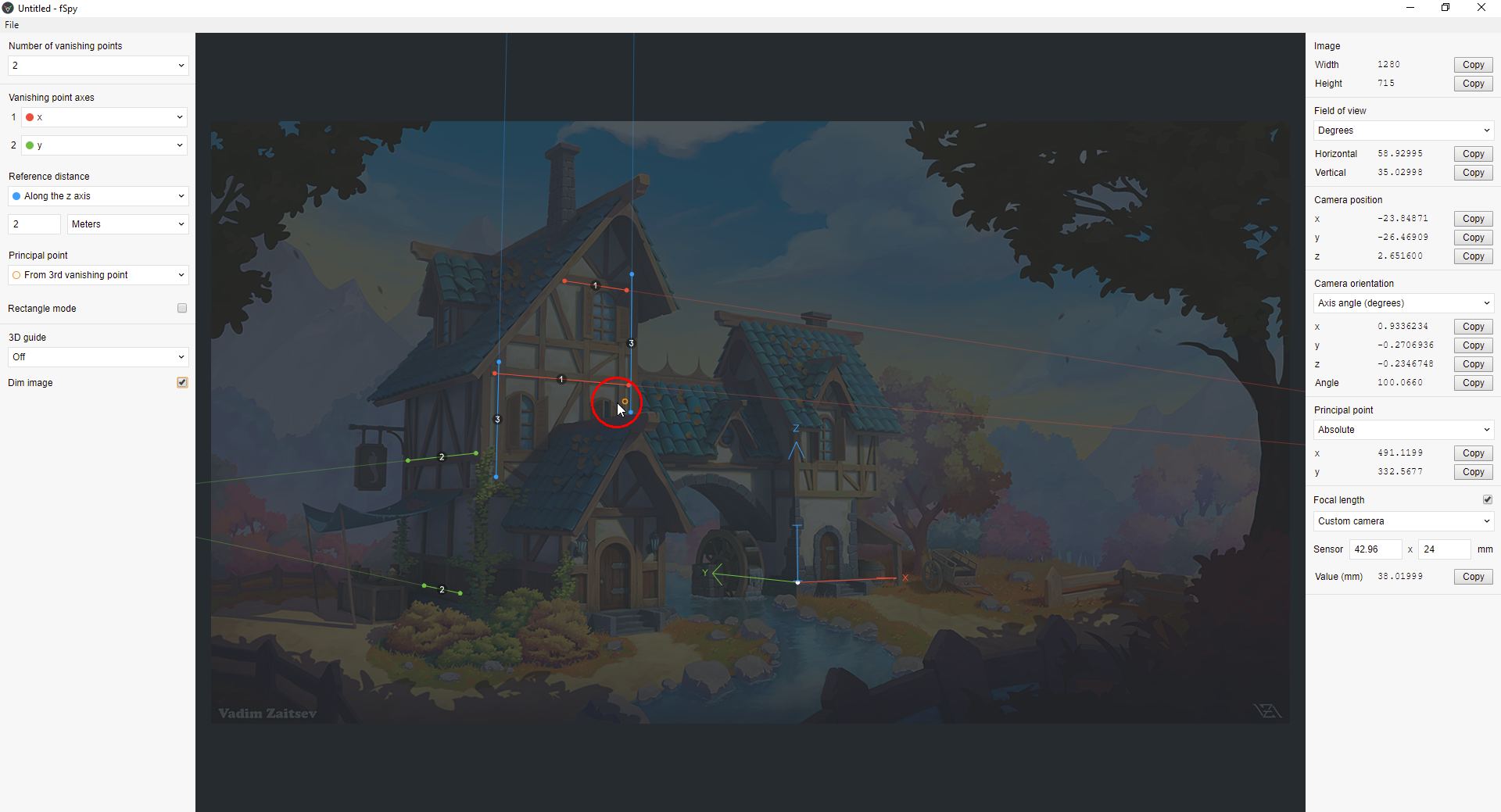
If you know where this "Principal Point" is in your image, you can mark your vanishing points so that the calculated "Principal Point" (little orange circle) overlaps with the real "Principal Point" or comes at least very close to it.
With SHIFT + Left Click and Drag, you get a magnifying glass around the endpoint you're currently moving for positioning a line for the vanishing point calculation.
Blender 2.93 Alpha seems to be very sensible to selections since it already happened very often to me that selecting something with Left Click made the program crash 🤪.
With the roof tiles added, I'm running into a problem since I can't get the tiles get aligned properly at the right side of the house's front side although the number of tiles is correct:
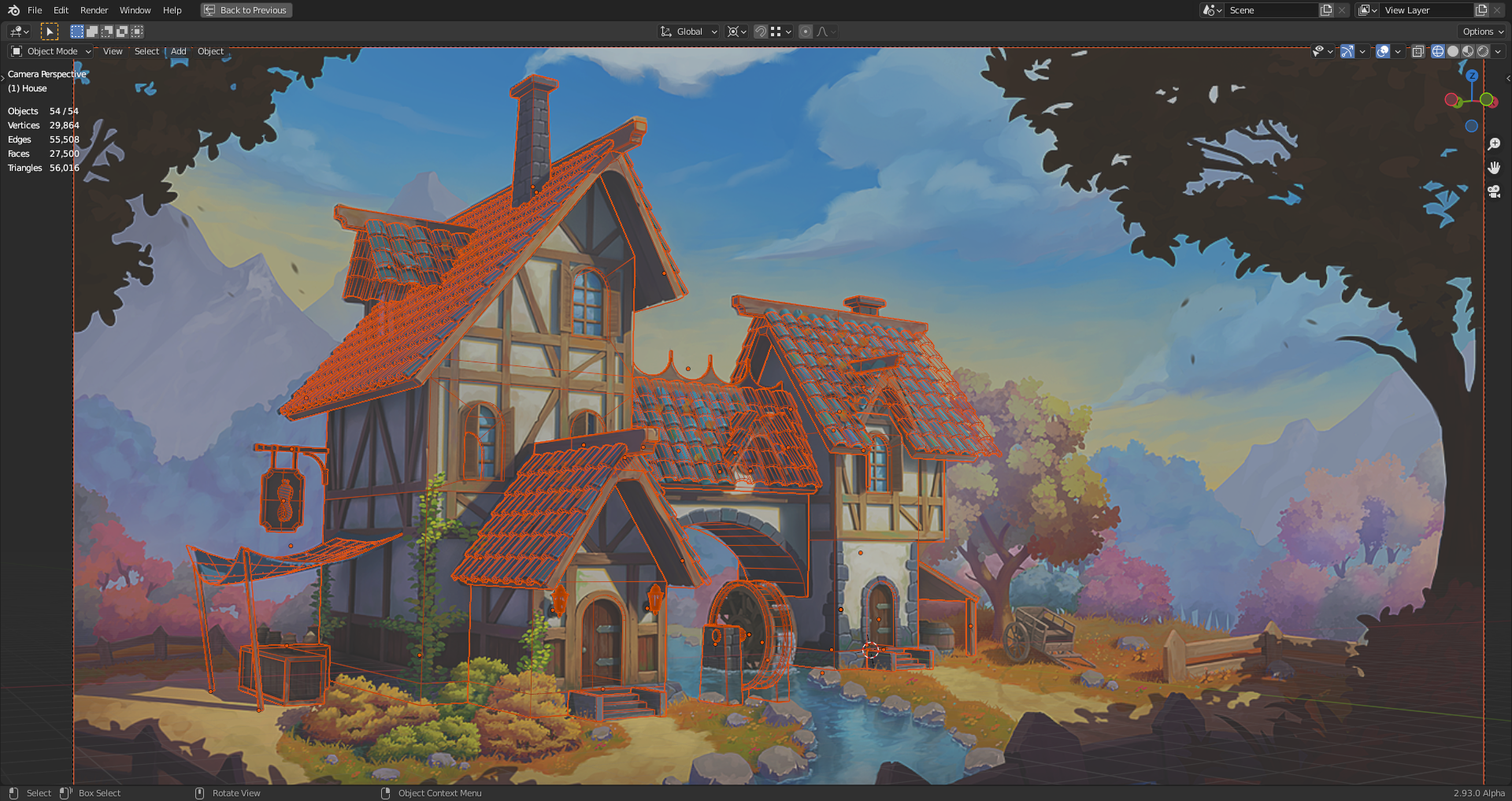
"Blender 2.93 Alpha seems to be very sensible to selections since it already happened very often to me that selecting something with Left Click made the program crash 🤪."
Perhaps a secret plot to encourage "right-click select" to come back in fashion? 🤔 I've actually switched back to RCS. For simple reasons: I like the W hotkey and the ability to tweak verts with a right-click/hold while modeling. It also gives the index finger a little breather while the ring finger gets some important work to do. Silly reasons, I know.
![]() duerer wow, you're matching the art insanely well! To achieve like 80% match of the roof tiles...wow, that's impressive. I wouldn't have even attempted.
duerer wow, you're matching the art insanely well! To achieve like 80% match of the roof tiles...wow, that's impressive. I wouldn't have even attempted.
PS: I sent you an email 😎
Thanks Kent @theluthier and ![]() spikeyxxx ! I'll try with less wide tiles on the roof of the mill tower.
spikeyxxx ! I'll try with less wide tiles on the roof of the mill tower. ![]() harbinger_ua How did you make it fit? Another point is that the mill tower seems to widen slightly towards the base (which itself widens towards the bottom) since my model doesn't align there as well as in other parts.
harbinger_ua How did you make it fit? Another point is that the mill tower seems to widen slightly towards the base (which itself widens towards the bottom) since my model doesn't align there as well as in other parts.
![]() duerer I didn't :) All the tiles were the same size in my original blockout. All the slight differences I added later in photoshop. The main idea is for tiles to slightly vary in size and position, which would give them a more natural look. It doesn't have to be exactly like on my piece. Just be careful and don't overdo it, otherwise it will turn from naturally organized to just messy.
duerer I didn't :) All the tiles were the same size in my original blockout. All the slight differences I added later in photoshop. The main idea is for tiles to slightly vary in size and position, which would give them a more natural look. It doesn't have to be exactly like on my piece. Just be careful and don't overdo it, otherwise it will turn from naturally organized to just messy.
Also all the walls are strictly vertical. There's no widening in any part of the house. It might be perspective thing caused by lens distortion or something.
Thank you, Vadim ![]() harbinger_ua, for your answer 😀. I probably didn't match the angle between the camera and the house exactly enough so that the proportions of my house don't fit to the number and size of the tiles on your house. I've tested it and found out that with slightly less wide roof tiles and a higher number of tiles on certain roofs than in your original house, I can make it fit:
harbinger_ua, for your answer 😀. I probably didn't match the angle between the camera and the house exactly enough so that the proportions of my house don't fit to the number and size of the tiles on your house. I've tested it and found out that with slightly less wide roof tiles and a higher number of tiles on certain roofs than in your original house, I can make it fit:
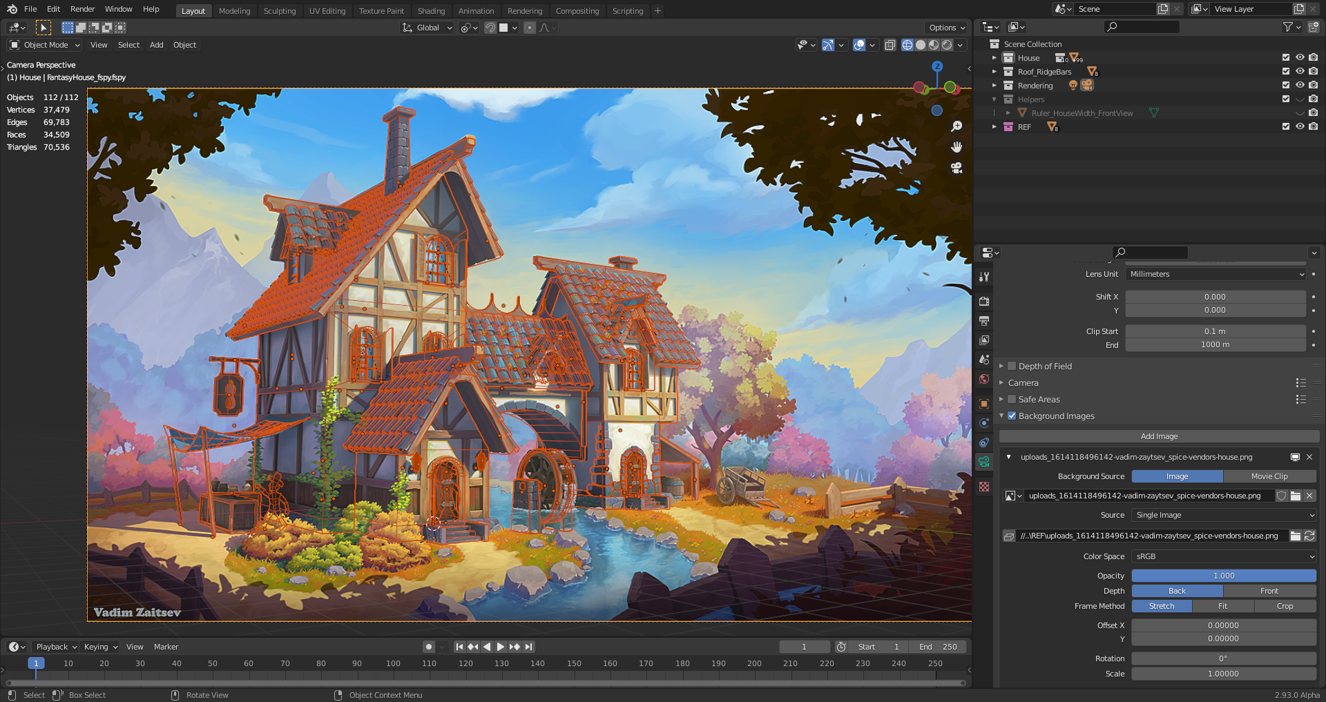
![]() duerer Can you upload your .blend to the google drive project directory? I'm thinking I will start from your base model + camera angle for the stream since you've taken such care to match it.
duerer Can you upload your .blend to the google drive project directory? I'm thinking I will start from your base model + camera angle for the stream since you've taken such care to match it.