Hey everybody,
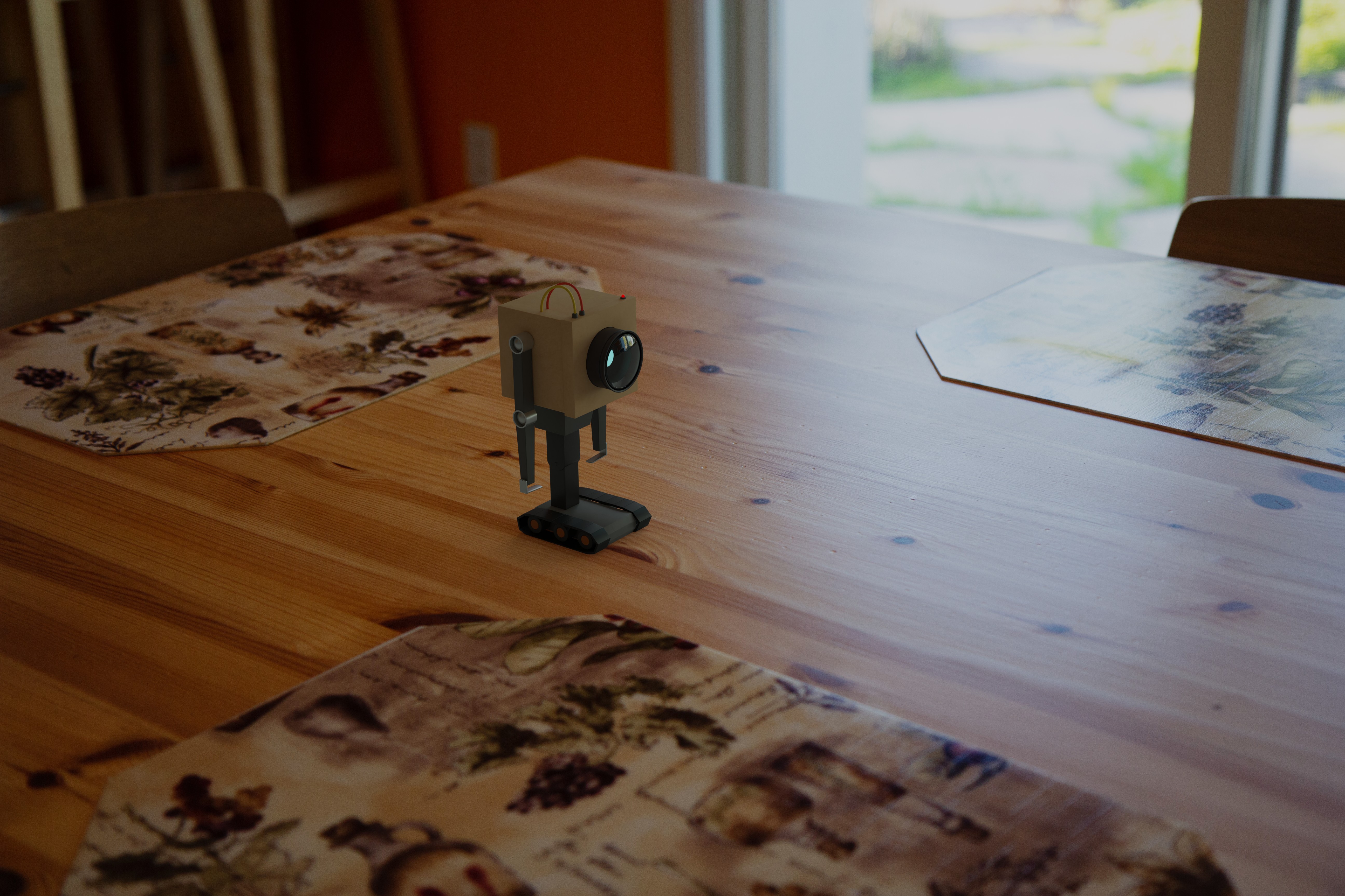
I'm doing my first VFX project, and was wondering how to improve the way the model is integrated in the shot below:
What I did already with this one:
Basically, I'm curious what would be the most important things to improve for the integration.
Thanks!
Hi Fred,
I'm not an expert but I have been trying to achieve photorealism in my own projects. From that perspective, your rendering looks perfect! Initially, I though you picked approximately matching indoor HDRIs from hdriheaven.com and matched the lighting so well. So I was actually going to pose questions about how you did it. But then I read that you captured your own HDRI of the scene which makes sense. In any case, you did a marvelous job!
I'm sure other VFX experts will chime in with advice on what to improve further. I couldn't find one.
Thanks mmishraka ! Maybe it's one of those things where the more you look at it the less you see clearly so I'm glad it looked good at a first glance!