Hey fellow Blender devs & artists,
A few months ago, I decided to learn all the steps to virtually stage empty rooms. I like to share my work on the photos of four different apartments.
I picked them off the internet, so I have guessed whether the space is a living room vs bedroom. I wonder how you make the determination. I have also focused primarily on getting the lighting to be right and trying to achieve the overall photo realism. This is why I have used the same furniture multiple times.
Initially, I was hesitant to share as many of the mistakes must be glaringly obvious to the experts here on this forum. But I decided to take a leap of faith and ask for your feedback about things that I am doing wrong and how to improve them further.
Appreciate your feedback in advance!


That looks quite nice! Okay so here's the feedback you asked for:
Top middle picture looks great but some lighting adjustments may make it even better. Hard to tell where light is coming from since the plant is casting a shadow behind it but the pictures are casting a shadow downwards mostly. And the table and couch don't appear to be casting and shadows.
The top 3 look very similar in color (and yes I can notice the repeatable furniture but you mentioned that already). I would say it needs a few more items for the eyes to gravitate towards. Maybe change to carpet or tile in one of them as well.
The pictures and plants are a nice touch but maybe add a small side desk or lamp desk or something to "fill" the space a little more.
The color scheme looks very bland on the walls but if white or earth tones are the goal then you nailed it.
The door on the top right image seems overly large in height compared to the couch on the left of the room. That scale just seems off to me. Plus it has 4 hinges. Most doors have three. But that is nit-picking here.
The bed in the lower right doesn't appear to be long enough. The floor boards might need to travel with the length of the room rather than against it because I can count about 10 boards for the length of the bed and from the looks of them they look about 6" in width and so that's less than 6 feet of sleeping space for a human (or just over 6 feet if the boards were 8"). I'd also shuffle the books around a little more since they look too organized. (just give them a little rotation and shift them over a little from each other to give a more realistic feel). You also have reflective light shining under the bed on the lower right where light would have a hard time doing that. Makes the bed look less than real in the room. The bed and desks should catch more light and cast more shadows especially with the light shinning and the daylight coming from the window.
Nice work putting yourself out there mmishraka
Hi ![]() blanchsb
blanchsb
Thank you so much for your feedback! I had a bit of a technical mishap -- accidentally deleted all the blend files from my external hard drive. I've now restored everything. That's why I took so long in responding back.
I've started incorporating your feedback. First off, the room that you provided the most detailed feedback about.
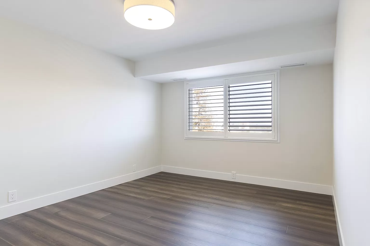
I thought about your calculation about inferring the length of the bed from floor boards. It seems logical. However, we don't have the exact data about the room in the original photo (I'm attaching here for your reference) so I actually scaled the scene assuming 8 ft ceiling height. Since the bed frame is 84'' long, I presume the ceiling might actually be lower.

I addressed the issue of the shine under the bed by placing a rug under the bed. (it's more like a trick than an actual solution :) )
I've tried to address the shadow issue by closing the room with a wall behind the camera. Earlier, I had opened the wall to let more lights come in.
Finally, I added an extra ottman in front of the bed to add more detail and removed the wall art to keep the room clean.
Here's the new staged look. Would this make the cut?
I'm unable to decide when the result is ready for an actual customer like a realtor. I would love to hear your thoughts on that if you have provided such a service to your clients and

My only client has been myself lol. I'm merely a hobbyist. Those changes do look quite a bit better.
Have you taken the fundamentals of lighting course by Jonathon Lampel? If you haven't I recommend it. He give some great pointers on lighting (it can really make or break the scene and deserves some good attention).
That definitely makes the room feel more "roomy" with all of your changes.
Appreciate your feedback!
Yes, I took the lighting course by Jonathon, It's really helpful! However, it still doesn't explain how to objectively evaluate the final result in terms of how well the inferred lighting matches with the real scene.
Do you know any professional Blender artist who provides virtual staging service?
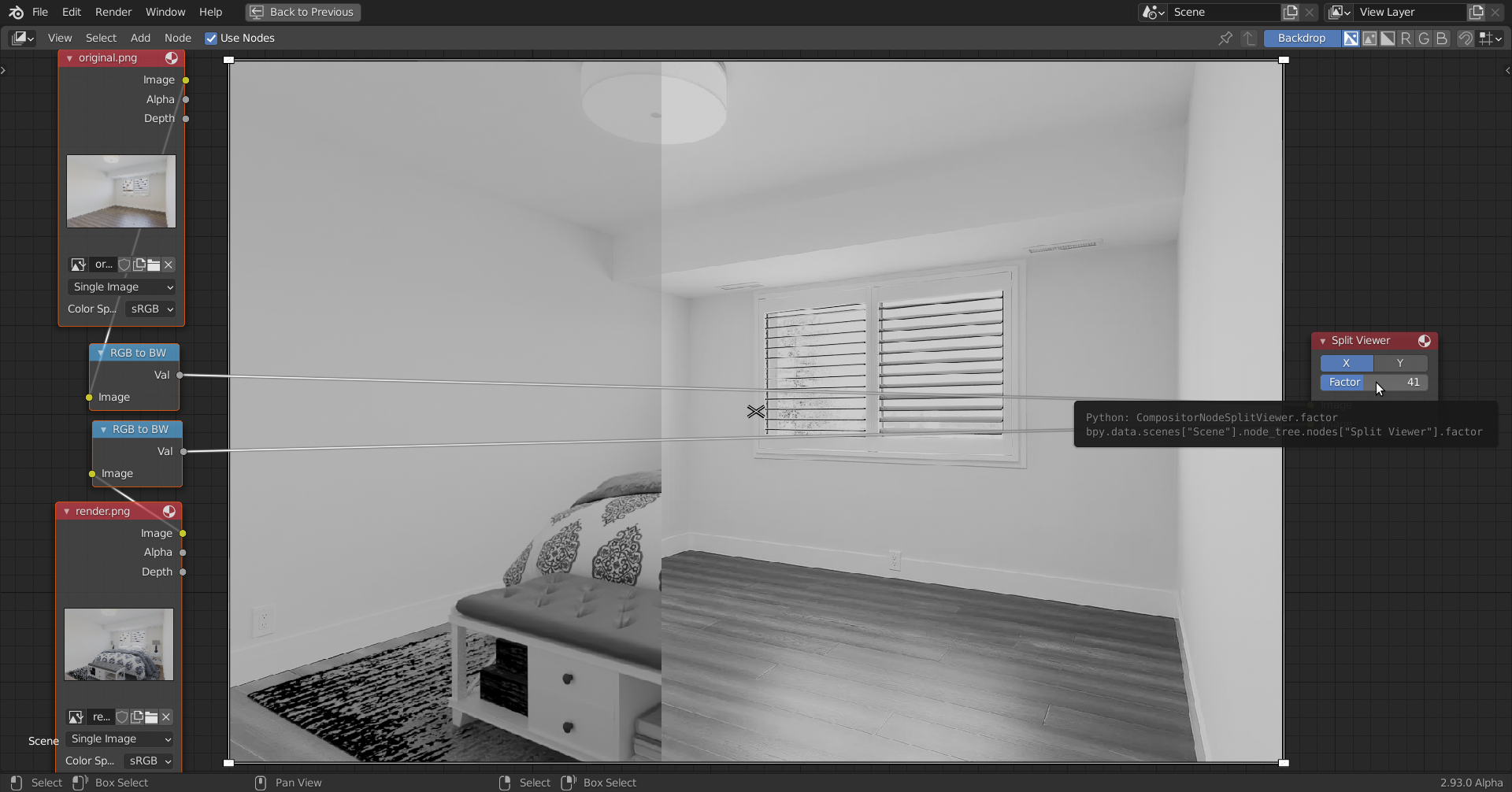
You're quite close I think. The original appears to have brighter lights. A trick to compare the two, is to only look at the Luminance ('perceived brightness'') of the Images, You can use the Compositor for instance:

Hi ![]() spikeyxxx
spikeyxxx
Thanks for picking it up! It was bugging me too. I'm using the alpha map created by the walls, floor and ceiling planes turned into shadow catchers to overlay the rendered furniture on the image in the compositor. I suspect that to be causing this overall dimming of brightness. Is there a way to fix that?
Hi, I'm not sure why a Shadow Catcher would do that, but did you turn off the Shadow in the Ray Visibility of the Shadow Catchers (you should)?
And maybe try increasing the contrast (either in the Compositor or in the Color Management Settings).
Here's what I'm doing. I might be missing something obvious.
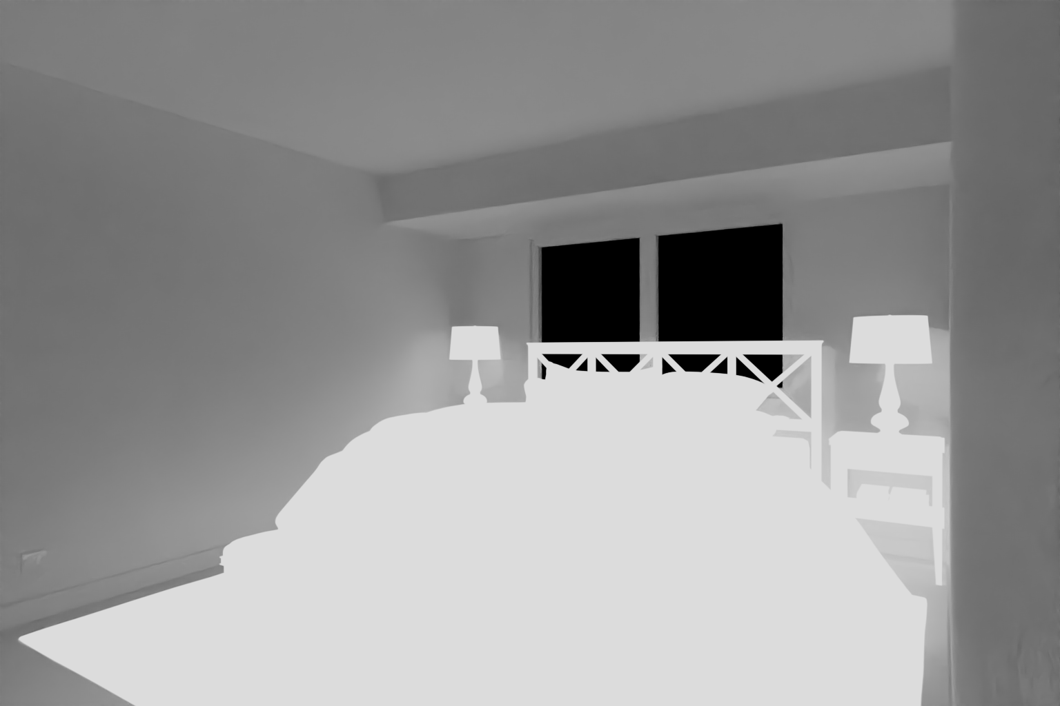
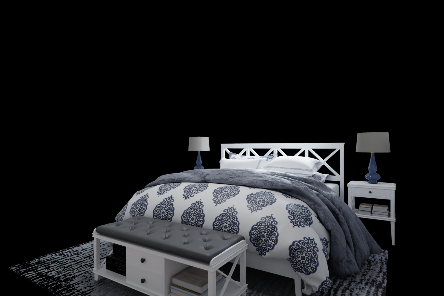
I combine the generated alpha map (top) with the image of the rendered furniture(bottom) and then use an AlphaOver node to create the final composite over the original image. Wouldn't the grayish pixels in the alpha map diminish the visibility of the pixel in the background image.


How did you get that generated Alpha map?
And you're right, the Alpha map should be black and white, not grey. Feed it through a Colorramp or a Math Node (set to Greater Than) to make everything that is not white black.
My understanding is that the shadows cast on the shadow catchers are essentially captured inside the alpha map which is generated as one of the render passes. Combining the alpha values with the original image then darkens the corresponding pixels and generate the final shadows in the composite. Is that the right way to do this?
I was thinking to use a color ramp but was wondering if that's indeed necessary. Do people use that extra tweaking in these use cases?