This is awesome! I love the variety of references and how close you've matched them. Here are a couple notes (from left to right, top to bottom):
The size of the light in #2 is a bit too small - notice how, in the reference, there are no sharp lines of shadow except for underneath his chin. This soft but angled and contrast-y lighting helps the reference show a sense of power, calm strength, and authority. The render captures close to the same lighting, but the emotion is quite different. Check the shape of the shadows and light on the eyes and how much of a difference that makes.
#3 looks spot on but could use more of the green rim light on the top of his head.
The blue tinted environment in #4 is doing a lot of work in setting the mood in contrast with the light on his face. Notice how colorful it is on the edge of his forehead compared to the render.
#5 looks nice and colorful, but not quite enough. The reference is _really_ blue and red. Try using more saturated colors and turning up the brightness (or lowering the exposure).
Overall, excellent job. Keep up the good work!
Looks cool.
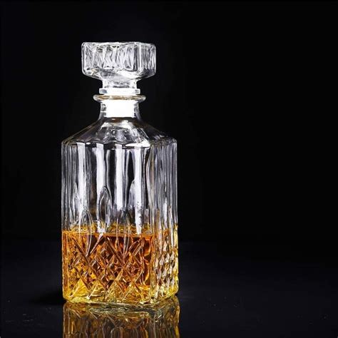
Only you seem to have the IOR of the fluid in the 'glass' wrong; it should actually look something like this:

If you say that water has an IOR of 1.333, then that represents the bending of the light, from air (IOR of 1) to water. The calcalution then goes something like: (4/3)/1 = 1.3333.
With fluid in a glass you get something like (with a glass IOR of 1.5, to make the calculation easier): (4/3)/(3/2) = (4/3)*(2/3) = 8/9 = 0.8888.
So there are a few different areas: at the outside of the decanter, the light goes from air to glass, at the inside, it either goes from glass to air, or from glass to fluid.
Don't worry, almost everybody gets that wrong;)