Hey guys,
I'm trying myself on a gargoyle sculpt right now. This is my progress so far:
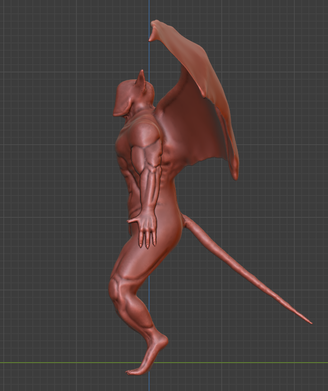
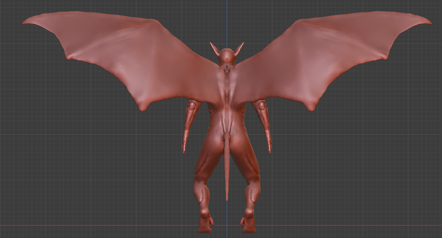
The head and the tail are not done right now, still WiP.
I'm very happy with it's feet and throat, but I'm not too sure with the wings, the chest and the arms.
It would be awesome, if you could give me a feedback to this sculpt to help me improve.
Greetings,
tobles
the thing that I think might help you the most right now is to get rid of the "lumpies"...
for instance the wings don't look like they grew on the gargoyle they look like someone lumped them on with clay...
good work so far
hope this helps
hi tobles,
retopology will not remove the lumpies in and of itself, especially if part of the retopo process is to project the details (the lumpies) back on to your mesh... so the best details that you make in your high resolution sculpt are the details you reintroduce to your retopologized mesh...
hope this makes sense and helps you along your way
Hey ![]() me1958424 ,
me1958424 ,
I've tried to do some "ironing" of the wings but I'm not to sure if I'm doing any real progress right here.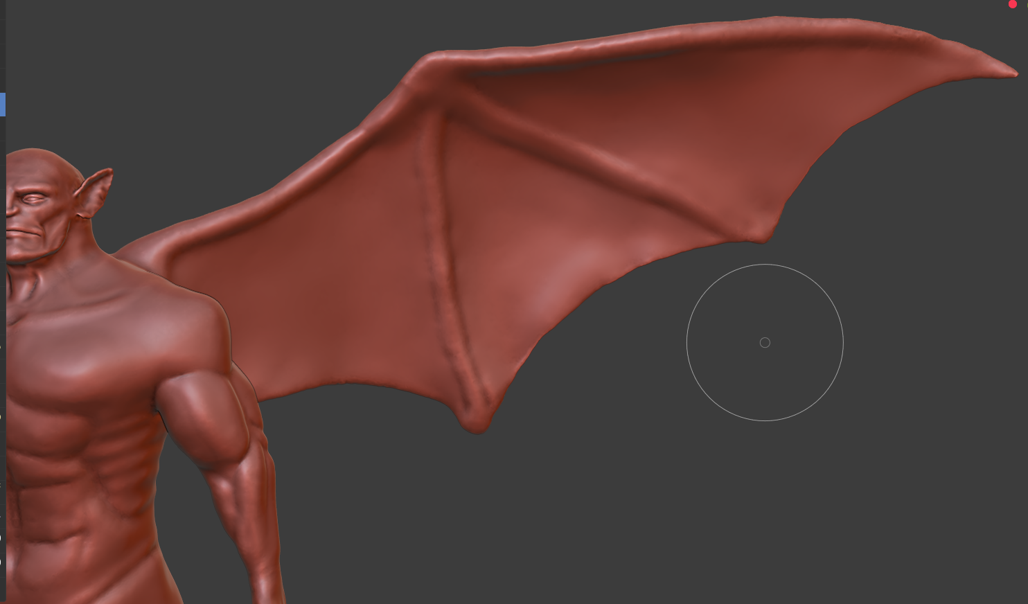
My technique is to first use the inflate brush on low strength and then to flatten things with smooth brush. Is that a good way or am I on the wrong path right here? It seems that I am loosing some volume with this technique which makes me guess I'm doing wrong or I did a bad job at sculpting.
Greetings,
tobles
Hey ttobles
I'm not great at sculpting, but from my experience make sure you remember to turn on Dyntopo and use subdivide edges with the required number of pixel detail. Every time you leave sculpt mode it turns off. I think the technique of inflate then smooth is they way to go, I have watched a few of @theluthier 's lessons on sculpting and he does it this way, and he is the master of sculpting.
Apart from some smoothing it does look good to me. Maybe the neck looks a little chunky, perhaps thin the neck under the ears or if you going for a more muscular neck, the muscle under the ear needs a bit more definition and maybe the top of the shoulder also, like you have done with the rest of the body.
👍
yes it is an improvement and now as @adrian2301 has helped with getting the correct tools in place you see it is a doable thing...
You're making excellent progress with your gargoyle ttobles! The primary advice I would give has to do with musculature. Right now the muscle definition feels like it's being chiseled on the surface of the simpler body shape. Kind of like a children's superhero costume with muscles sewn into the suit:
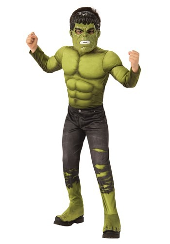
It's a bit tough to describe textually, but I diagnose the issue as musculature being limited to surface detail. Like taking a simple tube structure of the arm and etching muscle detail on it. Essentially the shape is still a tube despite the muscle lines.
But musculature actually affects the base shape significantly. A real-world muscly arm looks much less tubular and more like...well..a human arm. It's a completely unique shape with muscles drastically effecting the silhouette from all angles.
Maybe this will help: Change your viewport to visualize silhouette by enabling flat shading, single color material, and choosing black.
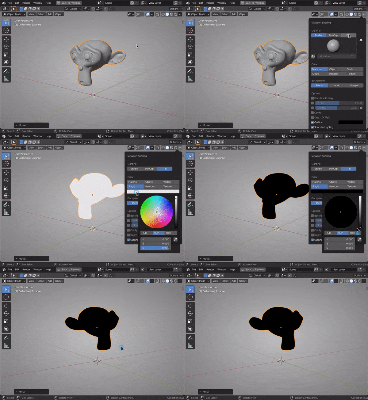
When you look at your sculpture in silhouette I bet you don't see much muscle definition but rather a smooth body outline. A muscly physique will still be readable in silhouette. Here's the example of the kid's hulk costume above in silhouette compared to the "real" hulk:
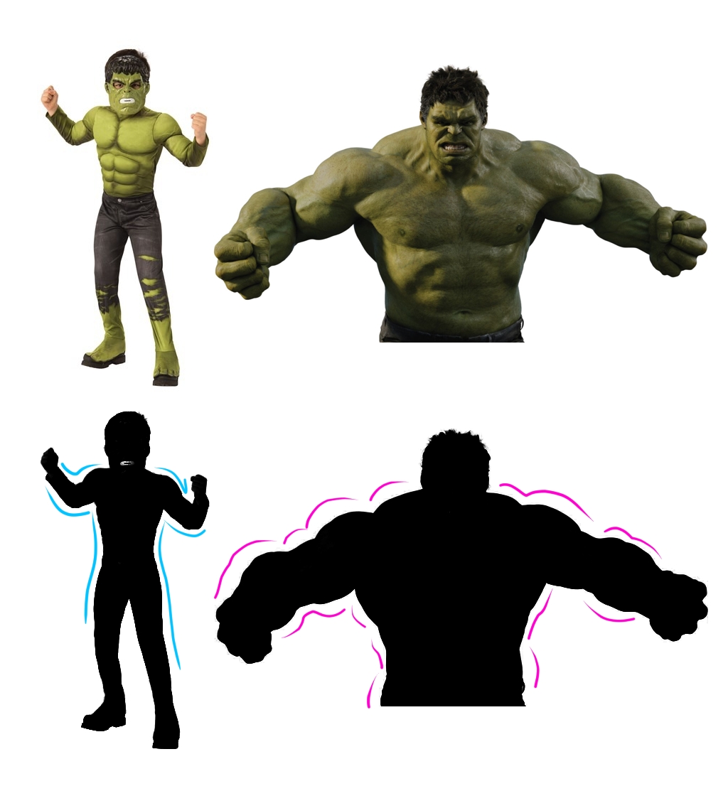
Notice how the costume's silhouette is smooth but the muscly physique is very bumpy. All this to say that your musculature needs to be more pronounced and to the point of affecting the essential shape of your character.
I hope that helps!
This is such a great example! This is something I struggle with as well. I would recommend examining the sculpt with cavity shading turned off, possibly trying a few different matcaps and spending some time rotating around the model. Cavity shading, almost by definition, results in the cavities appearing deeper (sometimes much deeper) than they really are.
Don't be afraid to really cut into the sculpt! If I'm ready to take a big step I will save off a copy of my current file and rename it something like "<projectName>_resculpt_001.blend" and (because I am a virgo I guess) put the previous files into a subfolder. This is almost entirely a psychological thing - by creating something of a "fresh start" but knowing I have my stash of old files I feel ready to make really big changes.
Another thing I've done that helps is to create a "Backups" collection right inside the blend file in which I place a copy of the sculpt in question (among other things). This way, once I've made some significant changes on the working version, I can compare the old and new side by side.
Keep up the good work!
Hey guys,
those are helpfull tips, thank you for that.
@theluthier I see what you mean with the "tube"-shape. I've put my sculpt in the mentioned viewport and looked at it from different angles.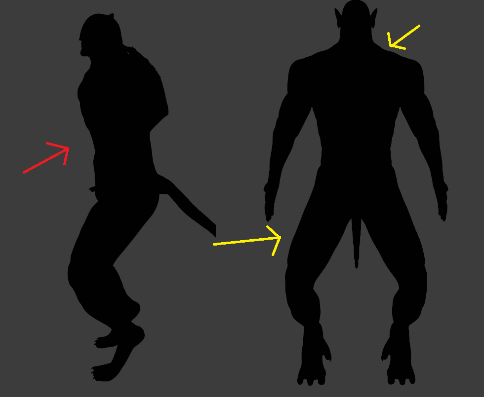
I'd say the stomach area (red arrow) needs more volume on the abs since it is too flat and there are no abs viewable in the silhouette.
At the tights and neck area (yellow) I guess adding a little more mass to the muscles will even that out.
I think the arms are doing good, aren't they?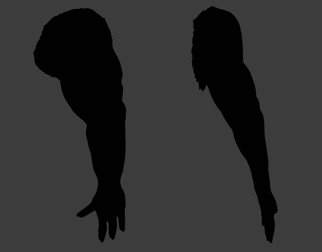
The first step is silhouette awareness. Now that you're looking through those lenses, you're ready to finesse the silhouette shapes. Here's a draw-over of a [sorta] muscly arm compared to yours:
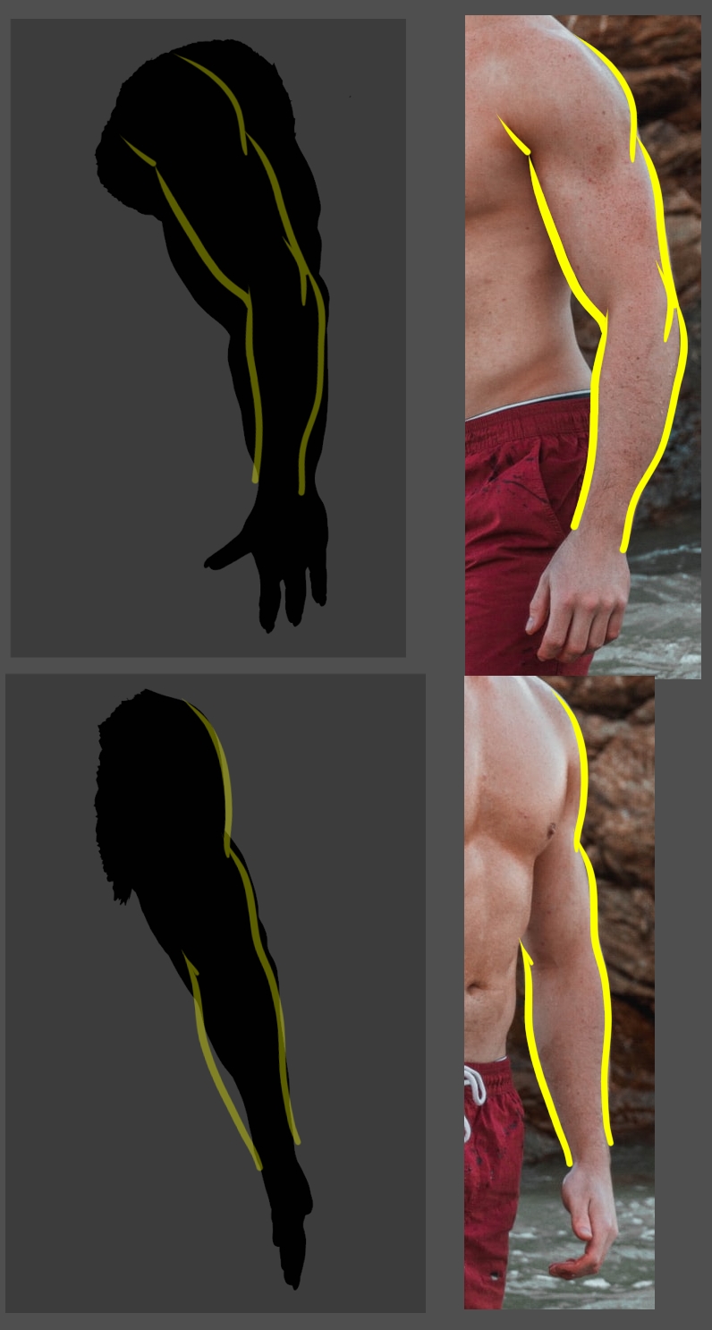
Hopefully this shows where your silhouette is off from a real arm. You don't have to use this specific image though -it's more an example of how to visually diagnose problems. If you're going for more of a body-builder type arm I recommend doing a similar draw-over/comparison with that kind of arm.
Hey guys,
I've spent the last days by going back a little and redoing the upper body. I took ![]() coyohti advise and creased in deeper this time to get some more geometry to define not only the muscles but also the volume that it creates a better silhouette.
coyohti advise and creased in deeper this time to get some more geometry to define not only the muscles but also the volume that it creates a better silhouette.
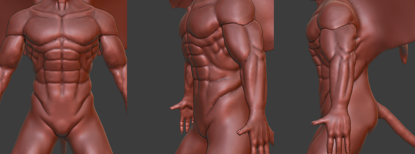
What do you guys think of this? Are the transitions between the muscles good or to rough?
The next step for me would be to get the body parts in shape like @theluthier mentioned.
Greetings,
tobles
Ahoi hoi,
I made my way to the neck and throat are today. I redid the muscles in these areas to aid the silhouette and the overall impression of this sculpt. Additionally, I've spent some more time on the arms. I think now the definitions are better than before.
I kept those proportions off from what would be natural on purpose. This decision was made because in my opinion it looks more wicked, evil and also threatening the way it is now.
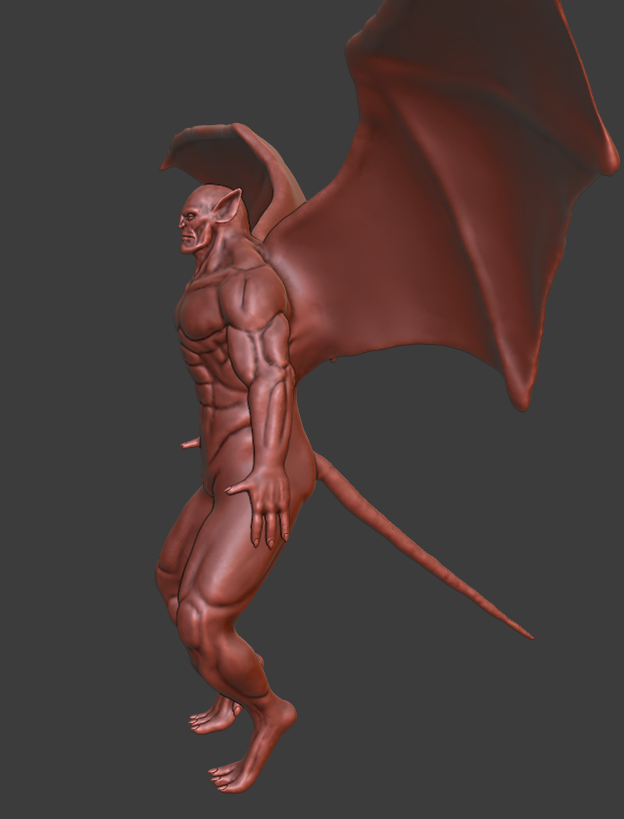
The next steps are:
->Make the buttocks look better
->Redefining the lap area
->Polishing the lumpiness
If you'd like to leave a comment or an opinion on how you think this looks, what is off or what is good I'd be grateful and thank you in advance.
Regards,
tobles
So, once again it's time for a post :D (By now it feels kind of a polybook)
I went back to the abs (again) to add some more volume to the muscle and at this point I'm quite confident that the silhouette got improved by a lot. I'm not finished with the final smoothing therefore there is still some lumpiness.
Furthermore I redid the buttocks completely and I'm pretty confident that this is another improvement and I also redid the lap area. 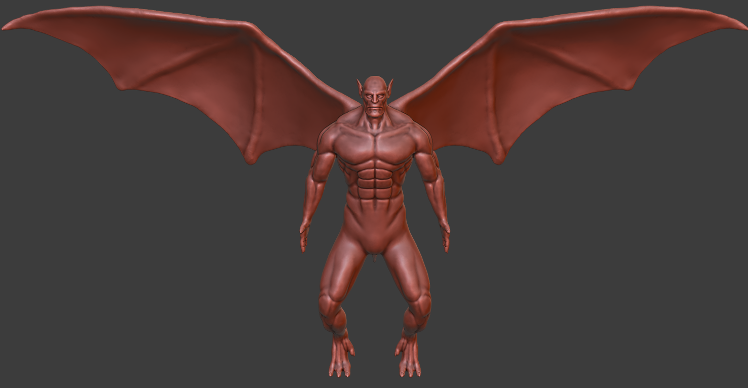
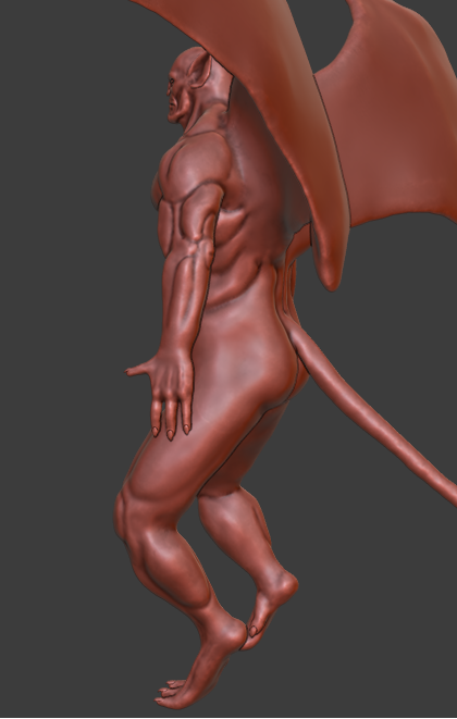
At this point I compared the actual version of the sculpt with the one from 3 weeks ago and I think coming here for some feedback really forwarded my sculpt and helped me improve.
To finish off the sculpting part (for now) I think the following things need to be done:
->polish
->redo legs (but not it's feed)
->defining the back area
->maybe add some mimic-folds to it's face so it gets a little "personality"
->clothing
Regards,
tobles
Hey,
so this is my final result for the sculpting: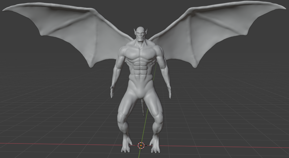
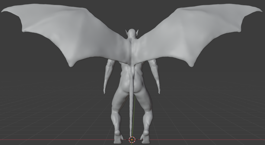

It's not really finished but I am. Right now I'm feeling like doing the same body parts over and over again only to end up with the same result as before. This sculpt was for practice purpose and I think I've learned a lot. For example in future I'll double think about the pose before starting. In this case the wings were a real pain since they were blocking the view on the back which made it difficult for me.
I know there is still lumpiness in this sculpt but I'll leave as it is for now and start with a new project with the hope to do better.
Let me know what you think of the sculpt.
Regards,
tobles
I think it's looking really good! I totally understand the feeling of reworking the same parts over and over. Sounds like it's about time to step away from the project.
Are you considering to retopologize it at some point or has this been purely for sculpting practice?
A note about the wings and tail - when I've worked with characters with features like this I usually sculpt the main form and add the tail/wings later. It's definitely a lot easier to handle those shapes with the Skin Modifier as block in with more detail added later. Here's an example on YT of someone using a similar workflow for bat wings.
Good work and I look forward to seeing your next project!