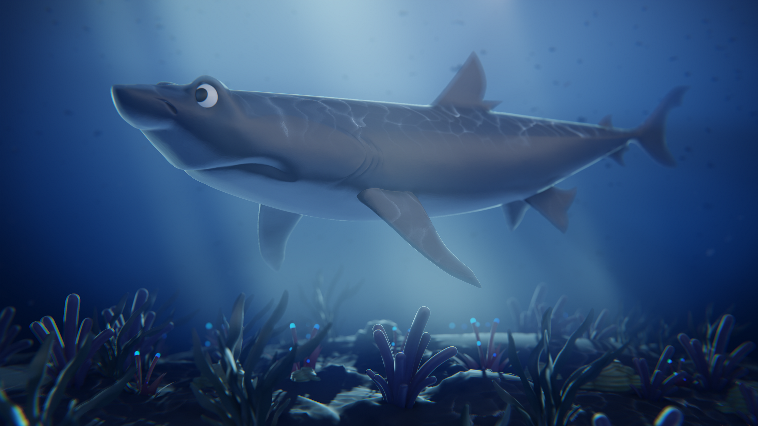
I decided to do a bit more with that sculpt and the follow video to the course by @theluthier was a huge help of course. Wasn't as interested in turning it into an animation so I focused on getting a cool wallpaper out of it instead. If I may, the artstation link as well: https://www.artstation.com/artwork/d89951
Fantastic result ddrakenreiter! I'm so glad you chose a unique shark and created the underwater scene for it. Awesome job 👏
Also thanks for plugging CGC in your artstation description :)
Glad you like it! Thank you and no worries! I try to credit people whenever it's the case, regardless of what I make. Without you awesome people teaching us, I would not be able to do this for sure.
I can finally show this, it is done! This one was very fun and I learned new things and made use of previous things I learned. @jlampel 's shading and lighting courses helped quite a bit in the final stages. Of course, thank you @theluthier for the course itself!
4 renders + 3D view available here: https://www.artstation.com/artwork/xJvGz4
I meant to redo the first 2 as I cleaned up the texture around those hinges (what was I even thinking?!)and made those changes to the lantern light. However, my PC started having some issues, exactly yesterday when I was getting the renders. Until I get to the bottom of it and fix it, I'm not sure I'll be able to make much stuff.

Yup, felt like I needed a visible light source to break up the colours a bit so I started making that. Wanted to keep the lighting from it stylized so I didn't model anything in it. Think of it as more of a magical lantern with a wisp inside!
There are 3 other renders on the artstation page by the way - same 1 open (with loot inside!) and 2 extra stylized versions of these two. Glad you like it in any case!
I fixed my PC after my last post, had to replace my power supply. I am back with something a bit different! I was watching various tutorials by BlenderGuru on Youtube and ended up putting this together:
https://www.artstation.com/artwork/9mORkW (closeup animation and shot inside)

Hello, I am still around! May have not looked like it, but yeah... Cyberpunk 2077 released and got so into it that I couldn't really do much else until I finished it. In any case, I started making this before it released and I finished it now:
Be sure to check out the main render in here: https://www.artstation.com/artwork/Xn24ky
@jlampel I would like to know what you especially think of that one, really happy with how the lighting and materials came together!

Got some ideas on what to work next. I would also like to finally come back to doing some courses here... There's just so much time in a day! :(
I like it! I immediately said, "Oh, that's cool" when I opened the link. It took a little bit for me to notice the arms, so the lightsabers looked like they were just floating there next to the faceplate. Once I noticed the arms and that they were crossed it made the pose make sense instead of feeling awkward. So, I'd probably add more contrast there to bring some attention but beyond that I think it works well. You might also want to consider less mist directly below the helmet because it does look like it's floating there without being attached to anything. If it was darker in that area it would just be assumed to be shadows instead.
Nice work and hope that helps!
Hmm, I get that... I did have the density of the mist in general lower initially and I played around with different values on both the gradient I had going and the density itself, a lot. In the end that's the render I liked the most. I wanted the shape to be more suggestive than anything, as the whole idea for that shot was a second thought, so I wanted something relatively quick with cloth simulation and some basic hands. It turned into the main shot of this piece though because I really liked it. I do wish I had put more effort into that side and used less mist, but I wanted to call it with this one and move onto something else heh. I do hope I get to make Darth Revan in his entirety one day (maybe when I'm more comfortable with sculpting things), because there's a lot more to his design than what I used in this piece.
Back with another piece, this time inspired a lot by Josh Gambrell's videos on hard surface modelling, as I was playing through Metal Gear Solid 5. This is the most fun I've had so far actually modelling, very cool workflow! What wasn't so fun was wasting like 1.5 days trying to bake some decent textures at the end of everything, for using on Sketchfab, as this time I really didn't want all my work on the materials to go to waste once uploaded there. In the end I got something decent going. Spent today having some fun animating a "parts explosion" and getting the renders out. Very proud of this one, actually put in a ton of work in it... maybe even pushed myself too much at certain points (looking at you sleepless night!).

More renders, 3d view and animation here: https://www.artstation.com/artwork/nYyoo6
There was a game called Timeshift once, made by Saber Interactive. It's one of the best shooters ever made if I'm being honest. The best game period when it comes to time manipulation mechanics. Like many games it had extras like concept art. There was this one piece of concept art from that game stuck with me all these years and it was of this SMG-flamethrower hybrid called Hell-Fire.
It can be seen here: https://lparchive.org/TimeShift/Images/94-08_Hell-Fire.jpg
The weapon is in the game but with a fairly different, more futuristic design. I think the overall style of the game may have changed during development and designs like that one had to change too.
In any case, after my previous model, I remembered that piece of concept art and took it upon myself to turn it into 3D. I am really happy with the model. Materials not so much, but I did spend less time on them. I tried different things initially but settled on simpler ones and let the model speak for itself hehe.

More here: https://www.artstation.com/artwork/GaPY1z
I may add a turntable animation, but it'll take time and I'll have to do that over-night.
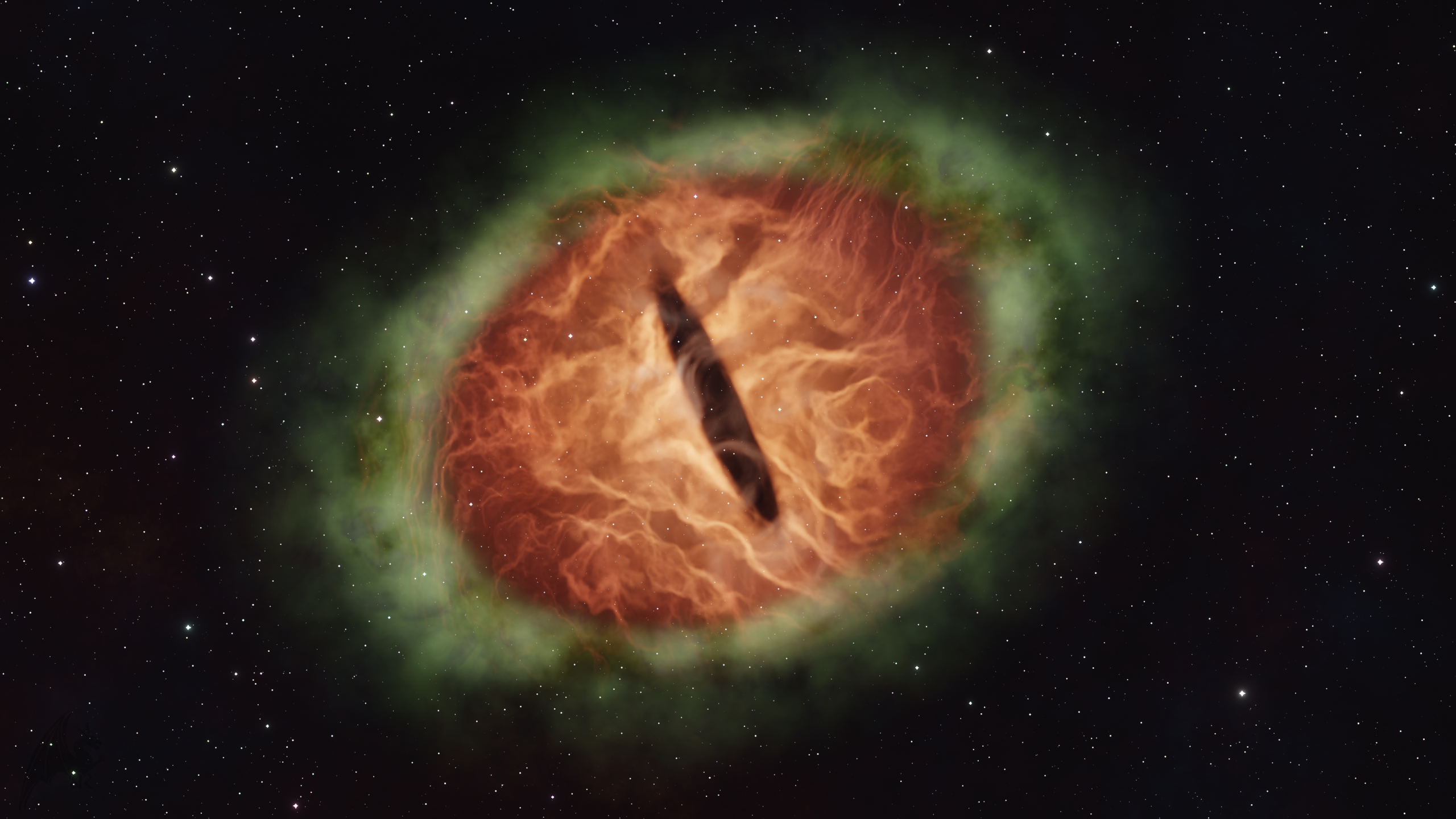
I have always loved space and astronomical objects. I've been meaning to make things like that in Blender pretty much from when I started learning. I started watching various tutorials on various things and found this guy Kaetsu on YouTube that has some really nice videos on how to make nebulas with volumetrics. Inspired by his take on a planetary nebula, I decided to turn my favourite art-piece of a dragon eye by SulaMoon into a nebula.
https://www.artstation.com/artwork/rAwV2e

I want to do more nebulas, planets, both from space and planet-side, maybe black holes, galaxies, etc. I've been struggling to get into projects that would take less time and these are perfect for that. Should also have a better grasp of nodes while doing these.
Thank you! Been trying to learn different aspects of Blender/CG, so the things I make are sort of all over the place.
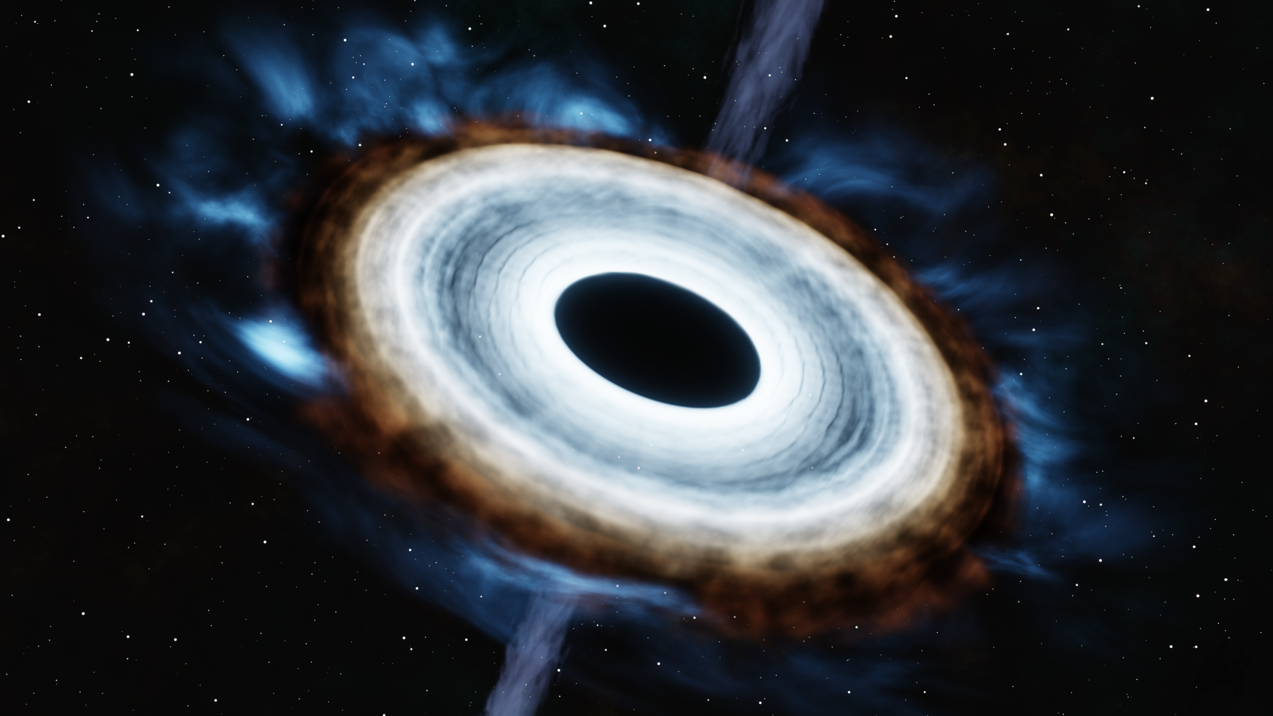
NASA's having a "black hole week" and so I've been reading up on black holes! What better time than now to attempt to make one in Blender.
Animation and an alternative shot here: https://www.artstation.com/artwork/kDxD8l
Not very happy with the animation. I could have done better, but there's always something that I don't realize until after I start rendering. I could work on it more and improve it, but I really do not feel like rendering an animation again haha!
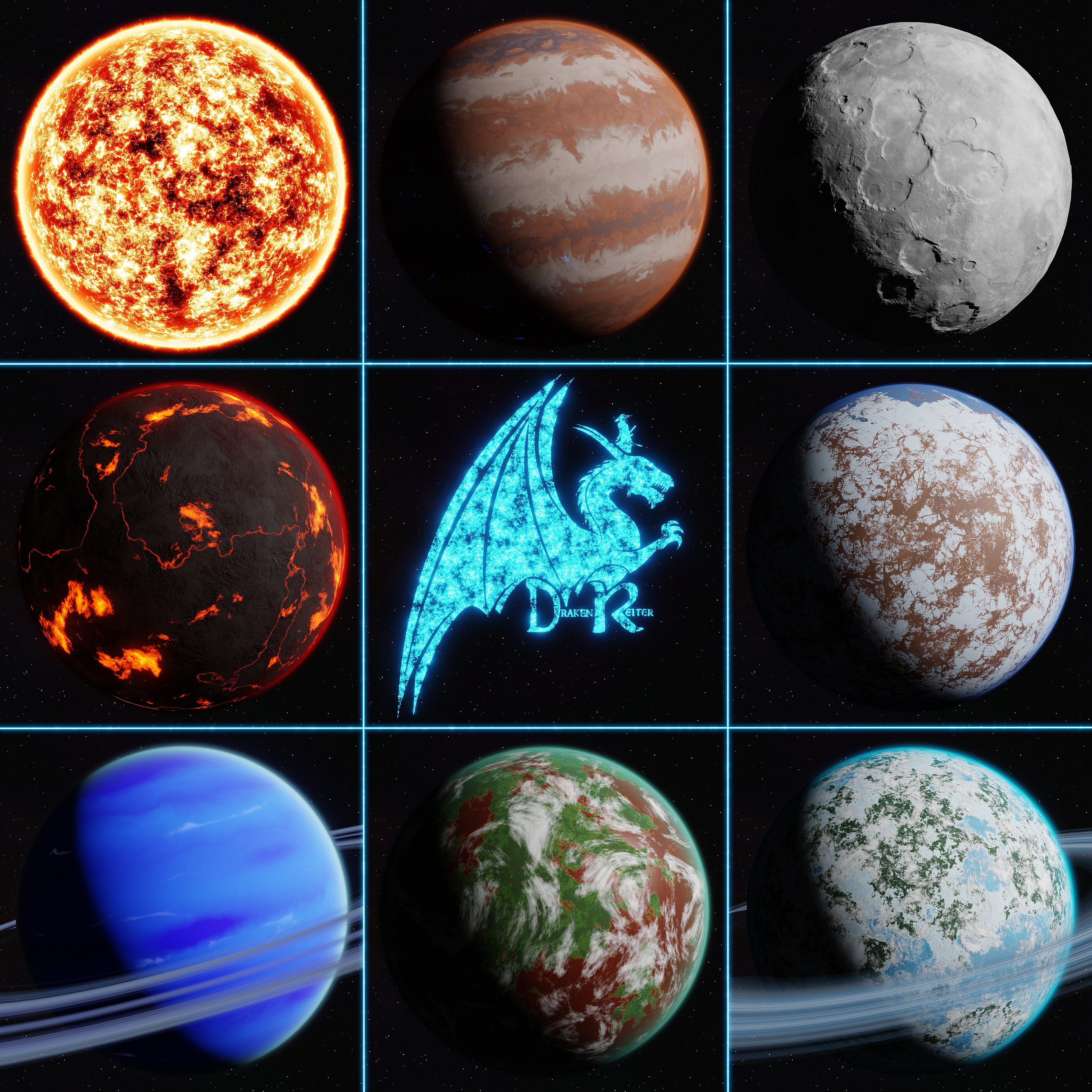
Been going at these for a while, but in truth they've been done for a week, maybe more, but I was just dreading rendering out everything I wanted hehe. That part also took some time. Very happy with this project. Making planets is fun!
Solar system and much more here: https://www.artstation.com/artwork/eaLkAY
