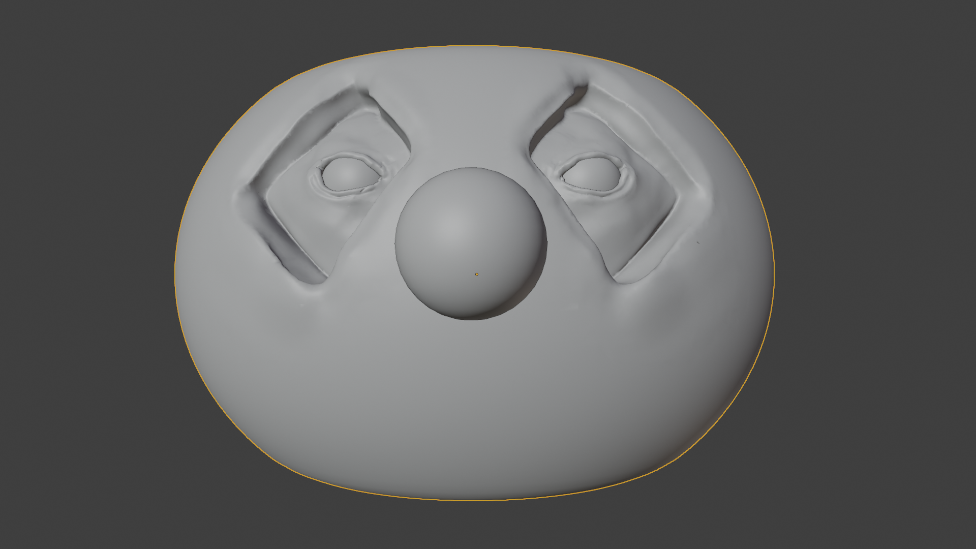
I've decided to try my hand at the epic pumpkin challenge. I'm not sure I'll get something worthy by the time, but the process is fun! I'll going to try to commit to regular progress updates at least until the deadline!
Funny idea 😀! I'm looking forward to see your progresses and the final rendering 🙂.
PS: I also don't know whether I will manage to get a final render just in time. ![]() spikeyxxx would like to participate, too. So, if there's nobody else, chances are high that we're among the chosen "Fabulous Four" 😉😁!
spikeyxxx would like to participate, too. So, if there's nobody else, chances are high that we're among the chosen "Fabulous Four" 😉😁!
Ok, only had a couple hours tonight so here's a roughed in mouth with quickly duplicated teeth... it's too smiley at this point, something to work on when I have more time!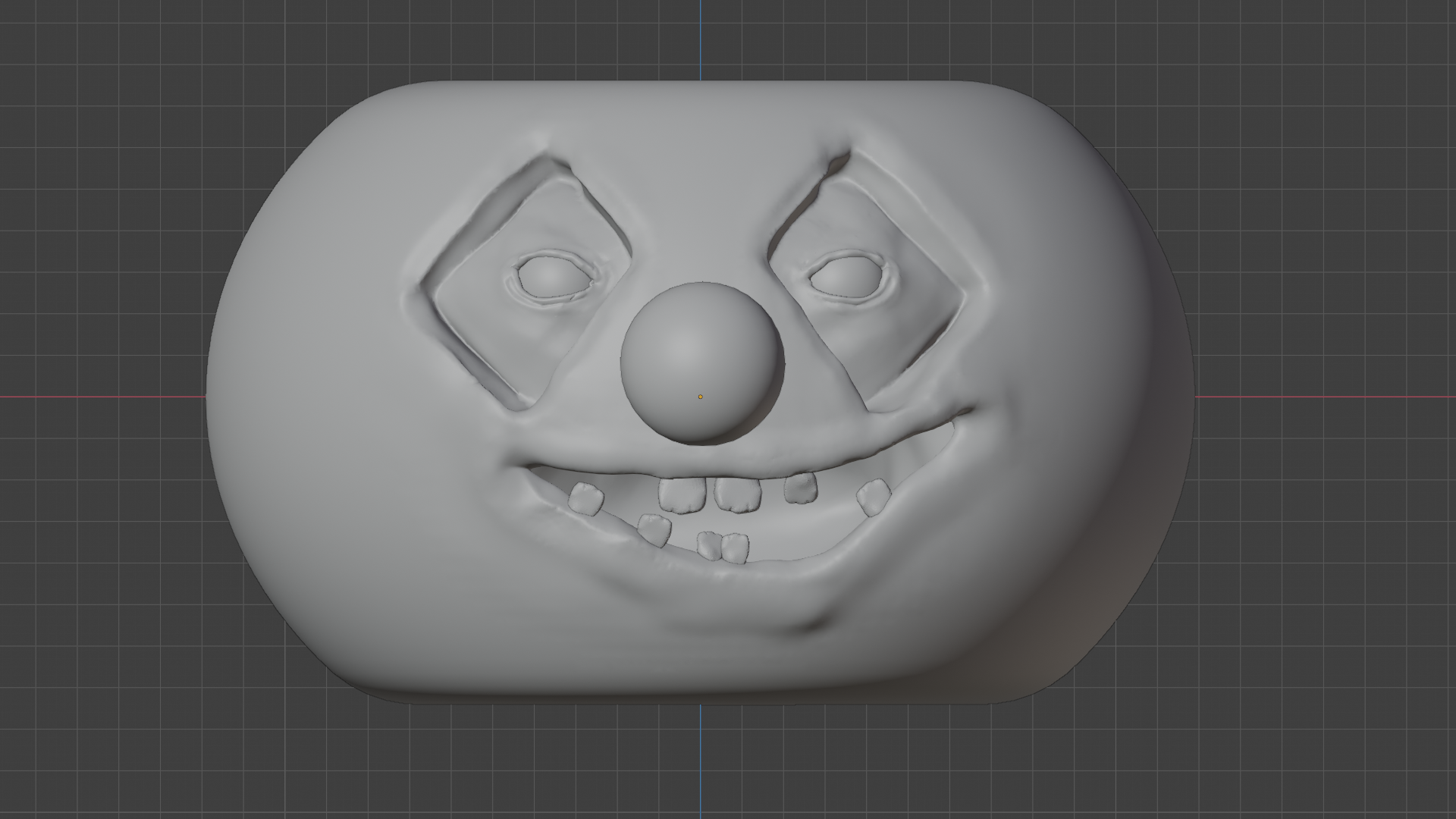
It's looking like a pumpkin! I haven't mastered eyelids yet, but I like the gooseflesh. I'm thinking it's time to think about materials next.
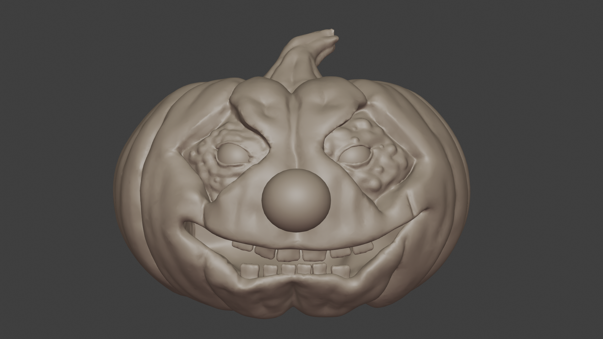
Spent a lot of tonight learning to make eyeballs... mine didn't quite work as well as ken's livestream, but I like them better than what I had! I still need to work on a bunch of materials and figure out what type of scene to put him in! It would be really nice if "right click -> open image in new window" wasn't the only way to see the full res image. Any chance we could get the functionality from the top post down here in the replies? 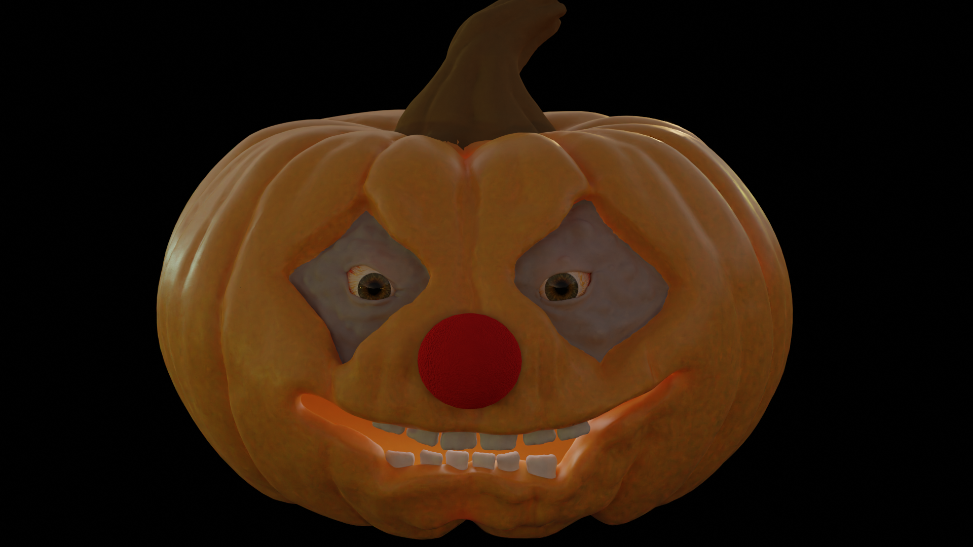
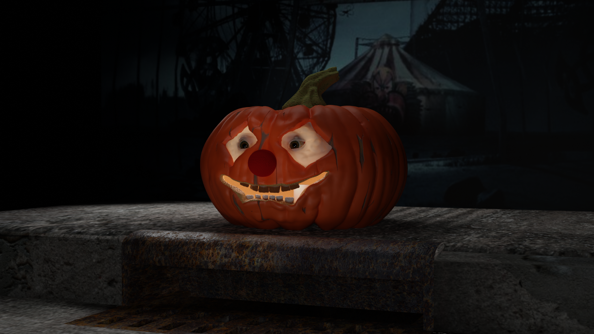
Here it is! I think I'm done with it? I feel like I could pick at it for ever though! I need to learn more about putting scenes together. The scene is a bit bare...
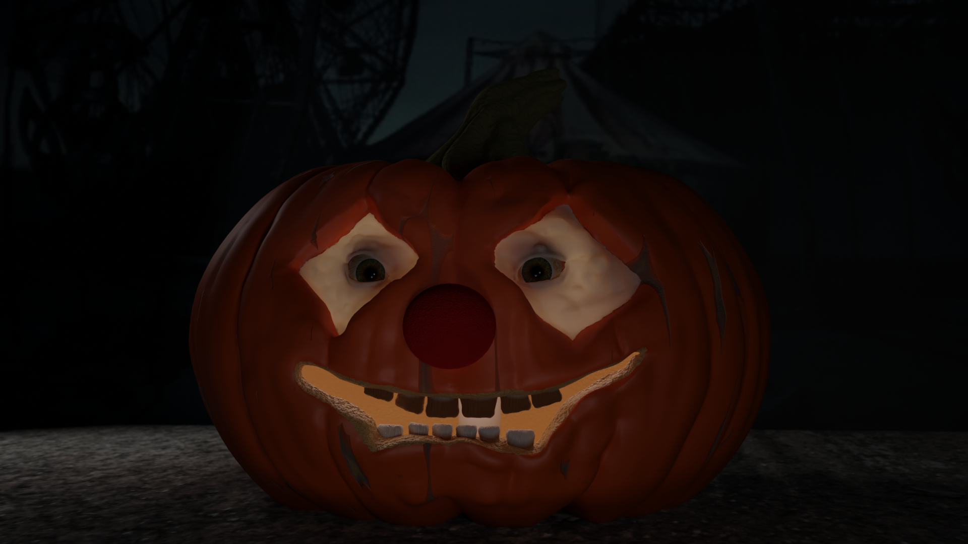
I tried creating a sidewalk with a sewer but couldn't get it to place where I was happy with it... also need to figure out how to do lighting, this feels to much like the camera had a flash.
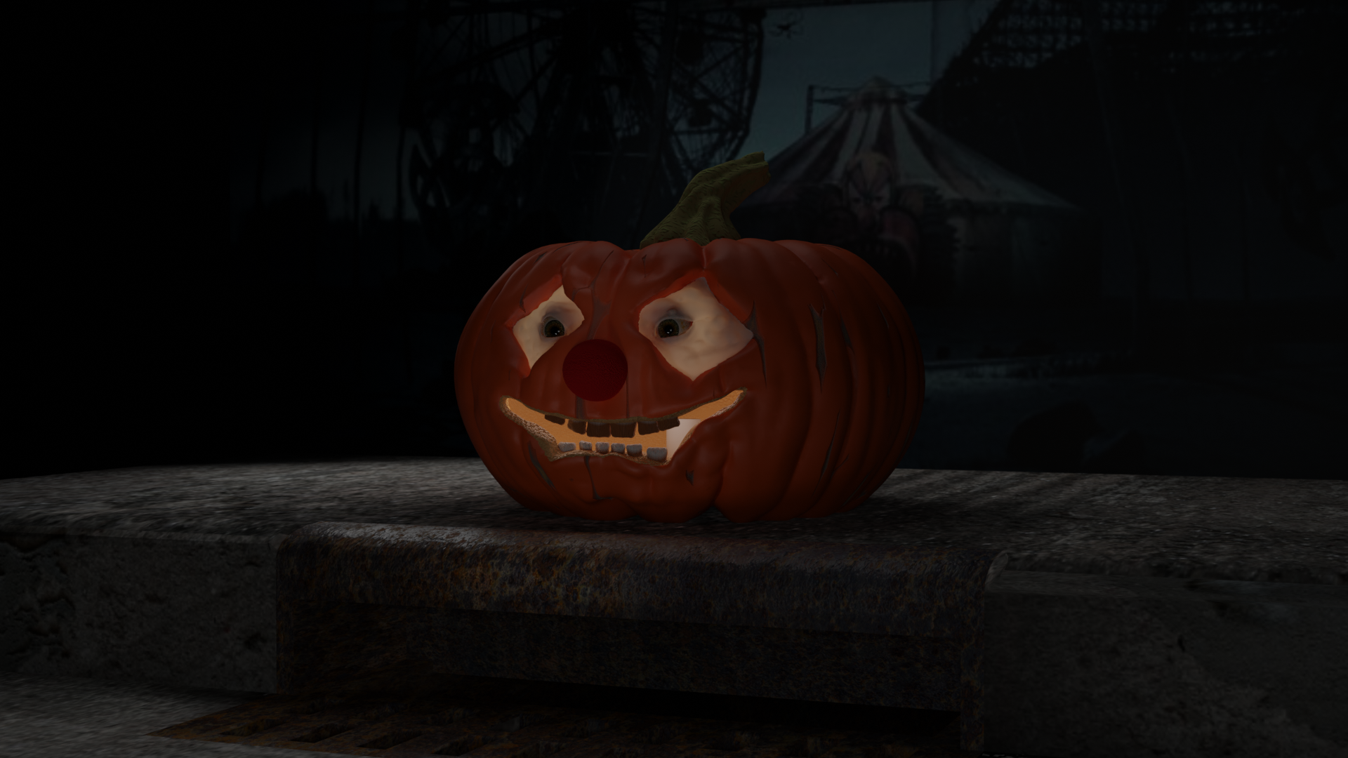
@jlampel Help? I've started but haven't completed the fundamentals of lighting course yet, but maybe you or anyone else could provide some advice? When I look at the two images above on my computer monitor I can see the grate and the details of the scarring on the pumpkin flesh, but on my phone it looks very dark and hard to make out. I like the dark and gloomy look that I have on my monitor... is it possible to translate that so that it works on a smaller screen without making it bright and cheery on my big screen? Thoughts? Any lights I add seem to take away from the fact that the waxy area around the eyes are translucent...
I usually end up telling people to up the brightness on the phones, I do dark scenes a lot and have the same problem. Phone screen's don't do dark and creepy well.
cchaoslillith thanks! it's nice to know I'm not the only one! I played around with using lighter skin tones and shifting some lights around... But I'll just let it be for now.
I like the dark and gloomy look that I have on my monitor... is it possible to translate that so that it works on a smaller screen without making it bright and cheery on my big screen?
Sure! First, dark values ≠ mood. It's more about the contrast. The image looks dark on your phone because the highest value is barely more than middle grey:
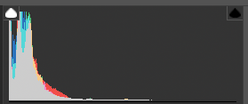
I'm using Lightroom here, but you can check this in Blender too using the Scopes tab of the image editor.
Here's a quick color correction. Notice the histogram is still heavy in the darks, but now the brightest areas are closer to white.
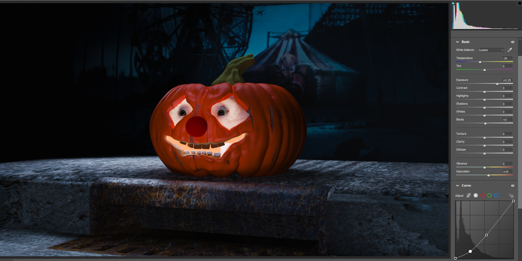
That image should show up fine on any device because it's using more of the dynamic range. Try to emulate this with lights and Blender's exposure setting. For more mood, mess with the colors instead of the brightness.
Hope that helps!
@jlampel Ah, that's awesome thank you! It didn't even occur to me to look at the exposure setting, I was trying to do it by adding more lights. Thanks again!
Ok... I played around with the gamma and exposure, tweaked some curves, but I really have no idea what I'm doing YET! I've updated my gallery with something with a little more pop.
I'm sure that's what most of us do... play around with different settings and make adjustments here and there for those happy accidents.
You got a great result. 👍