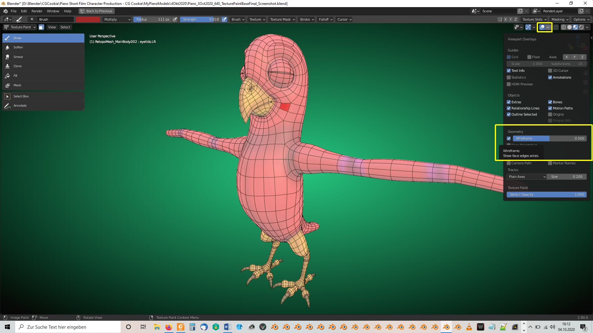
I've imported the "UV Map" for Piero into GIMP (with a black background layer for a better contrast):
PS: @theluthier Yes, the default "Fill Opacity" for "UV Islands" is 0.25 🙂✔.
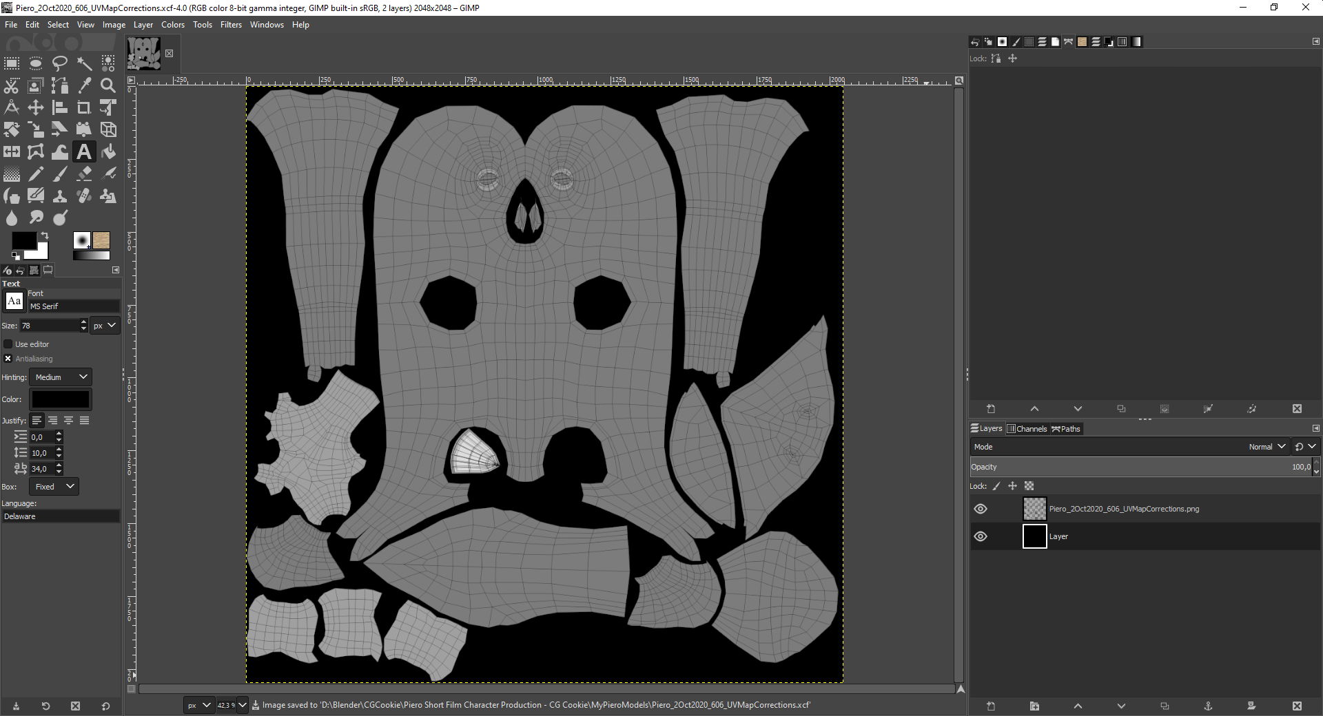
In Gimp, you create an "Alpha Channel" image by right clicking on the layer with your "UV Map" and selecting "Add Layer Mask":
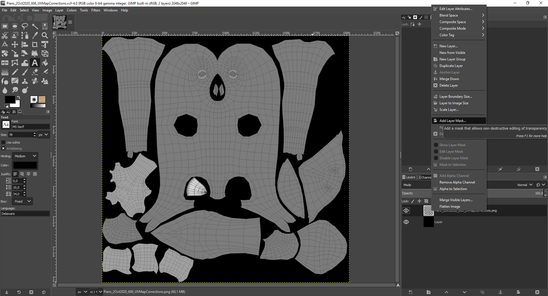
In the dialogue box that pops up, you check "Layer's Alpha Channel":
Alternatively you can get this dialogue by left click, holding and dragging the layer preview image onto the "Mask Symbol" (the second symbol from the right in the bottom right corner of the image directly above this text ).
Now, switch the display of your "UV Map" layer to "Only Alpha" by pressing ALT + left clicking on the "Alpha Channel Preview Image" (the right one of the two preview images of this layer):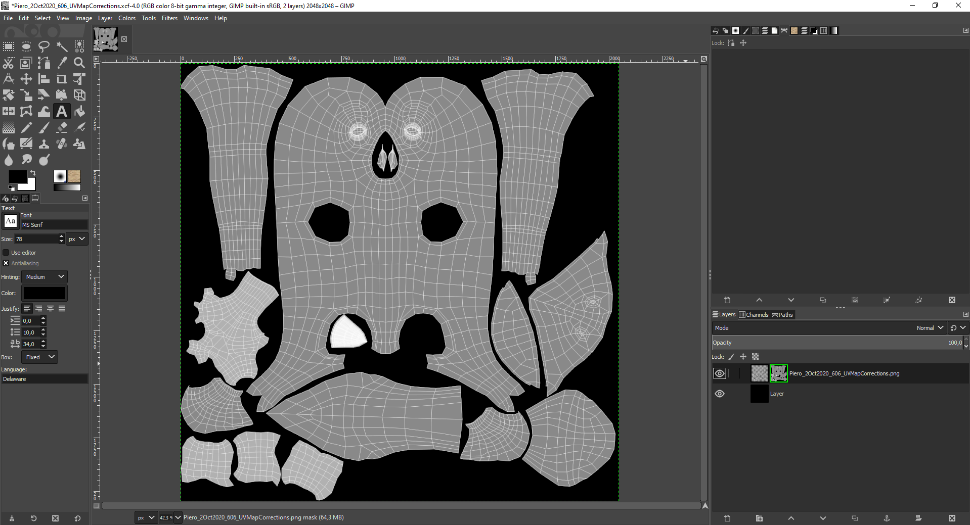
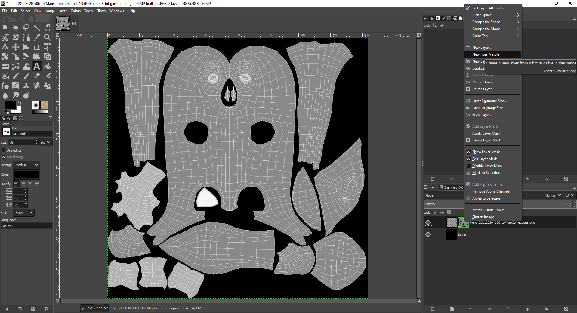
After this right click again on your "UV Map" layer and select "New From Visible":
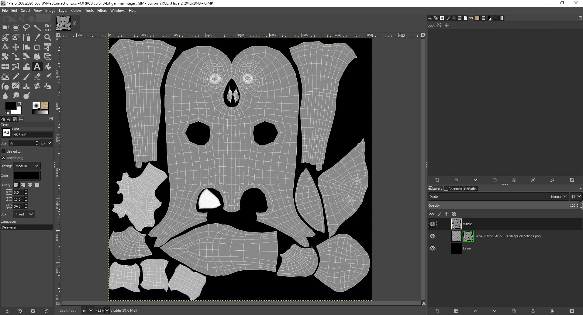
The topmost layer in your "Layer Stack" is now your separated "Alpha Channel" image:
In the menu "Colors => Curves", you can now strengthen the contrast so that your "UV Islands" become pure white:

This can be blurred by calling the menu "Filters => Blur => Gaussian Blur":
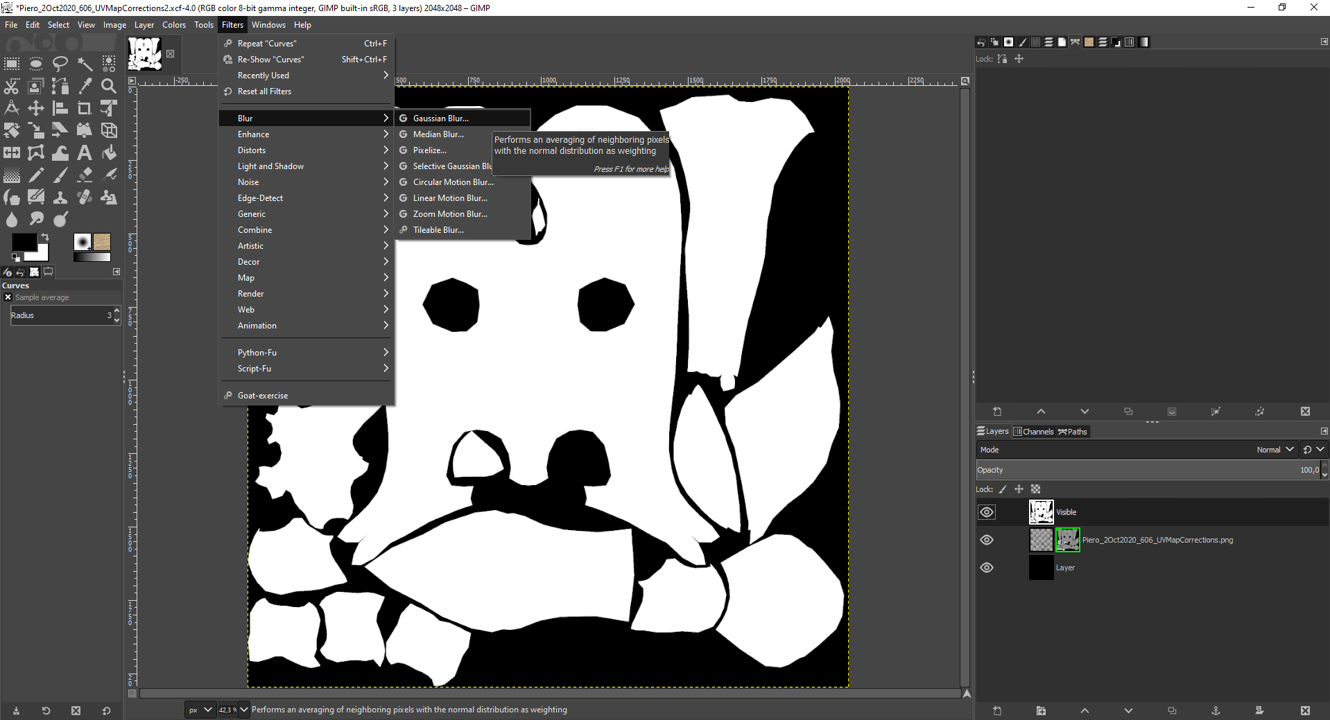
The "Size X" and "Size Y" values for the blur are linked a "Closed Chain" symbol per default so that you only need to change one of the values for achieving an even blur in all directions:
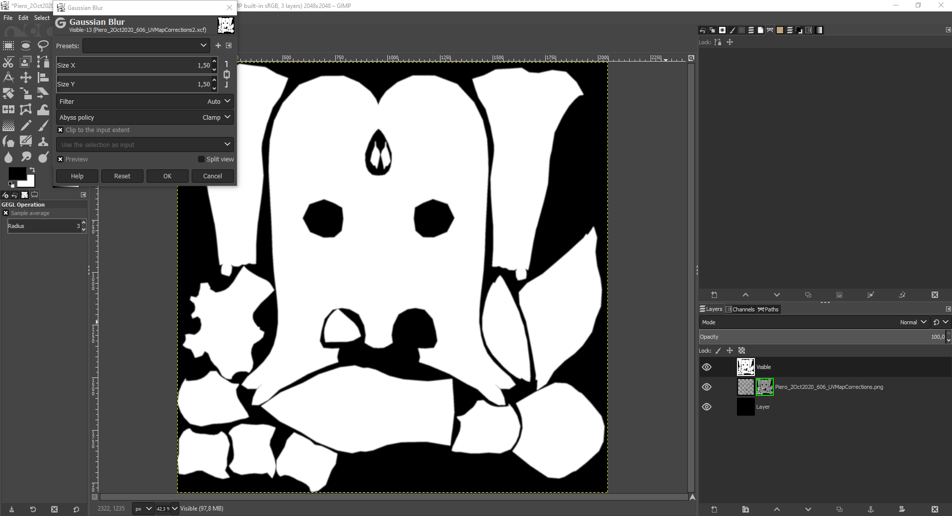
With a blur value of 10 for "Size X" and "Size Y", you get this:
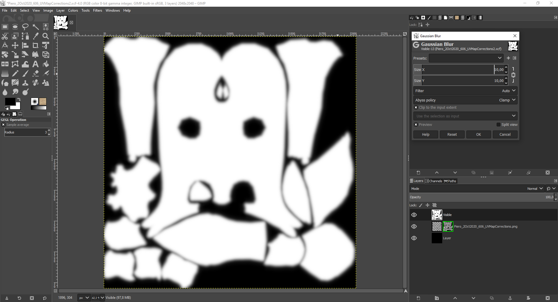
You can adjust the sharpness again with the "Curves" dialogue box already sesn in the top image of this post:
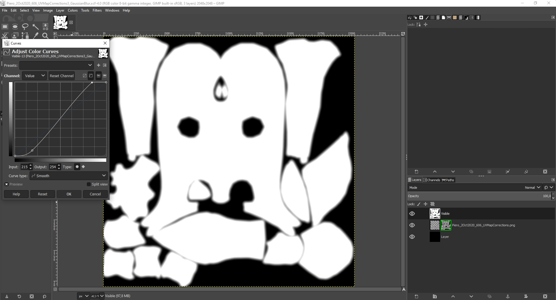
I've just opened Piero's "Base Texture" in Blender 2.66.1 (which I use for modeling Piero) and Blender 2.90:
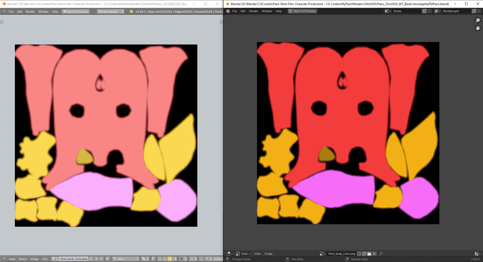
Blender 2.90 shows the colors as seen in GIMP whereas version 2.66.1 brightens them. In general, Blender 2.66.1 looks on my computer brighter than Kent's same version of Blender in the video although I've installed the same "Momo" color theme and only changed the "3D Viewport's" background color. Other versions of Blender on my computer don't show that unpleasant and washed out looking brightening.
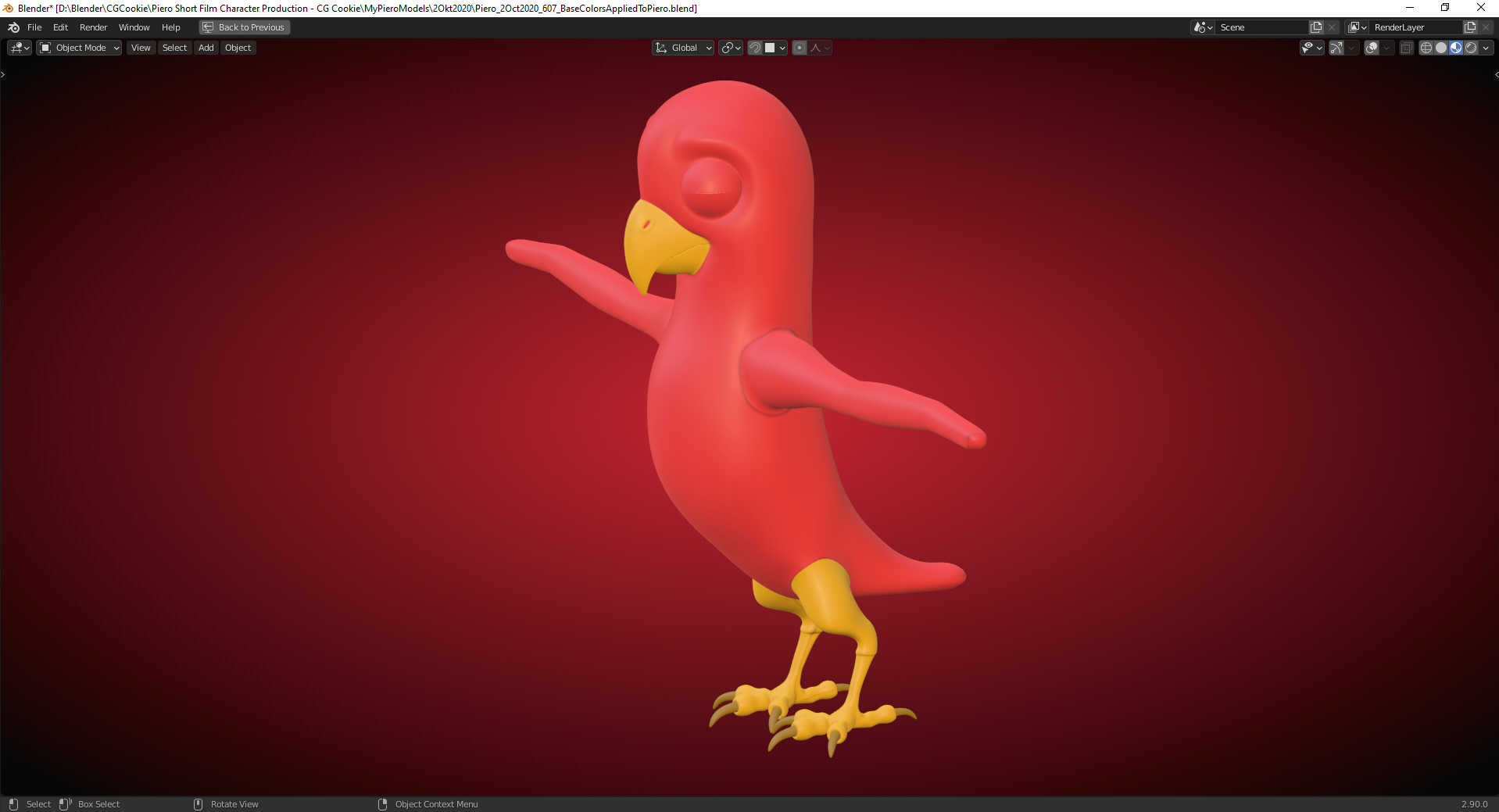
Compared to this Piero with base colors in Blender 2.90 ("Materiel Preview" = Eevee) :
PS: Blender 2.90 imported the layers with the different feather types correctly as collections:
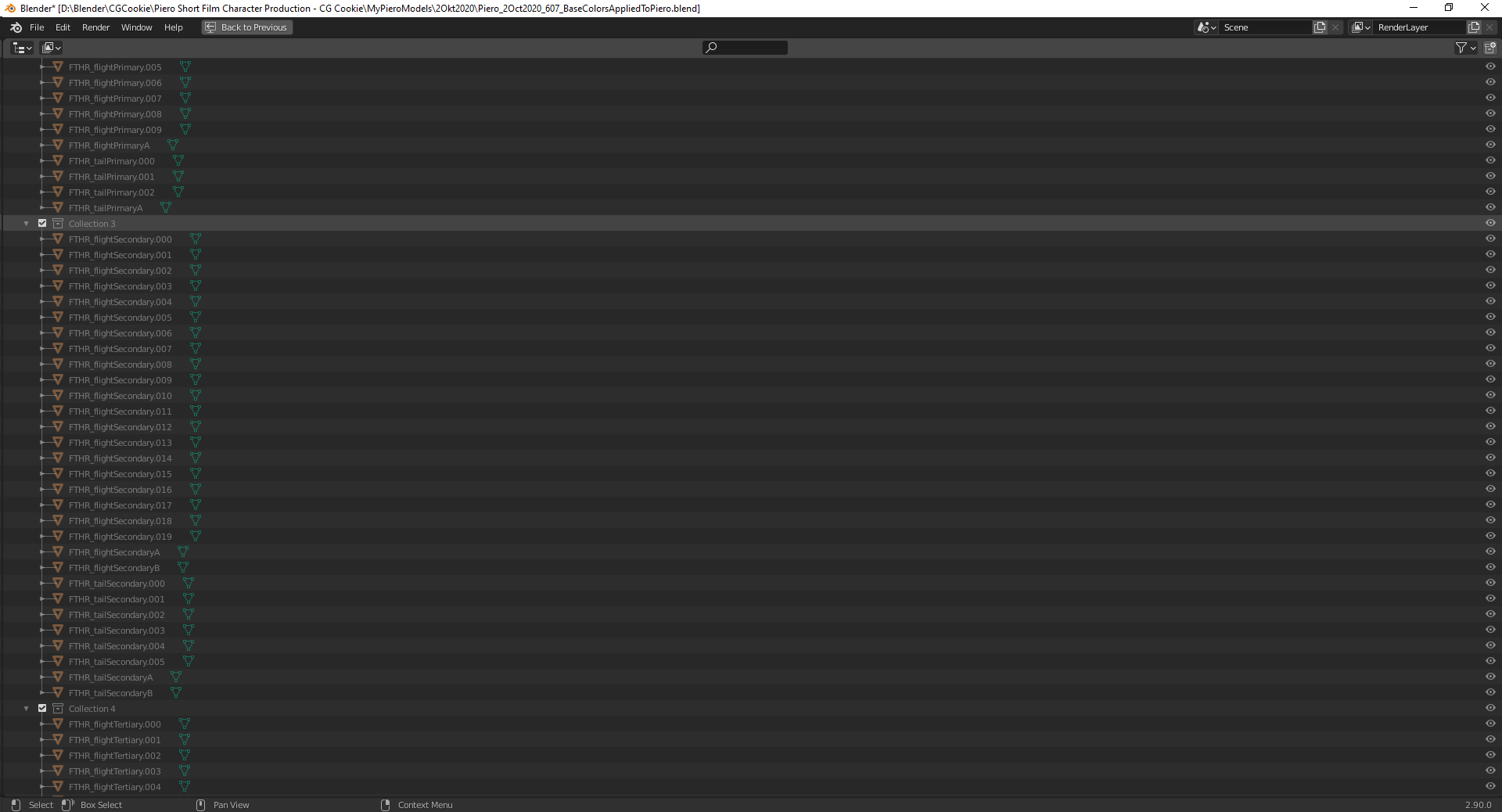
Only the names for the collections have to be transfered manually.
But the feathers aren't displayed in the "3D Viewport" and the collections are greyed out. I've tried it with "Link to Scene" in the "Blend File Mode" of the "Outliner", but this didn't work.
The solution is: Right click on a greyed out collection and select "Visibility" => "Enable in Viewport":
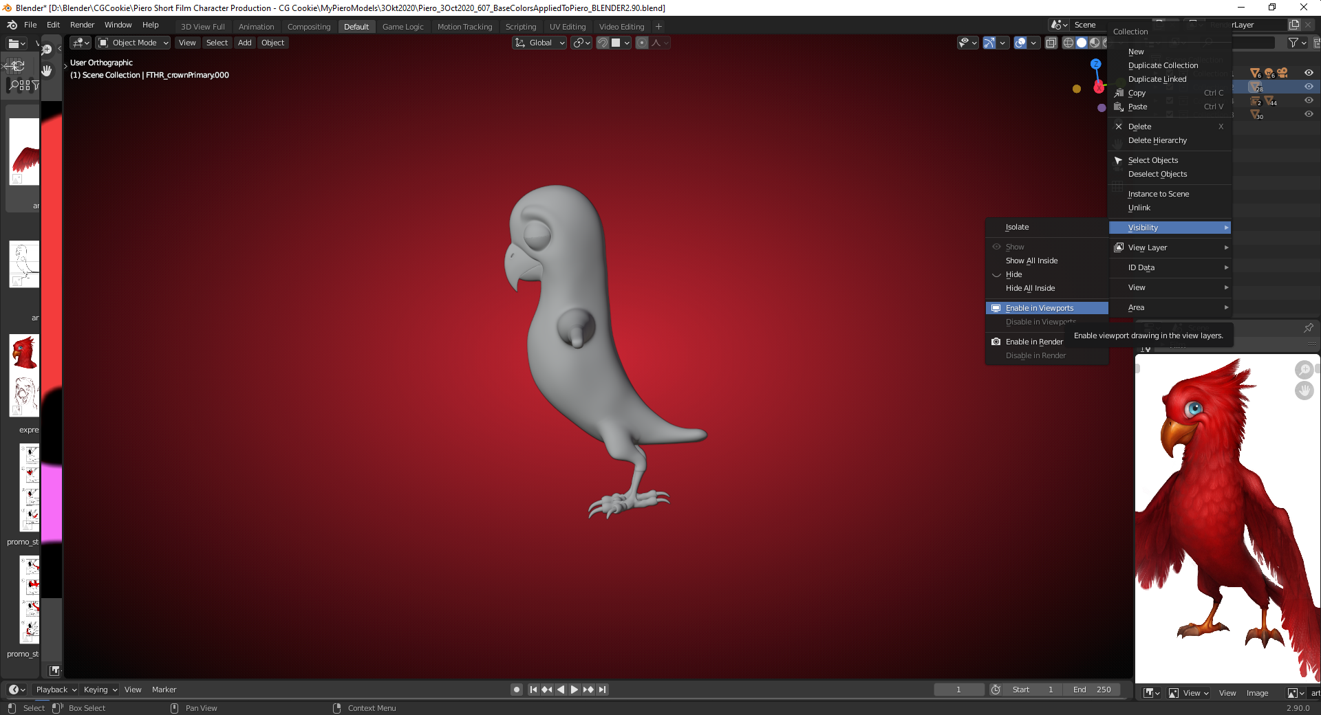
Note: In some versions of Blender 2.8 you can find this under "View Layer"=> "Clear Exclude". According to this thread here, this feature has been removed in some Blender 2.8 versions and then added again (I didn't verify it!) and the shortcut ALT + E doesn't work anymore in later Blender 2.8 versions.
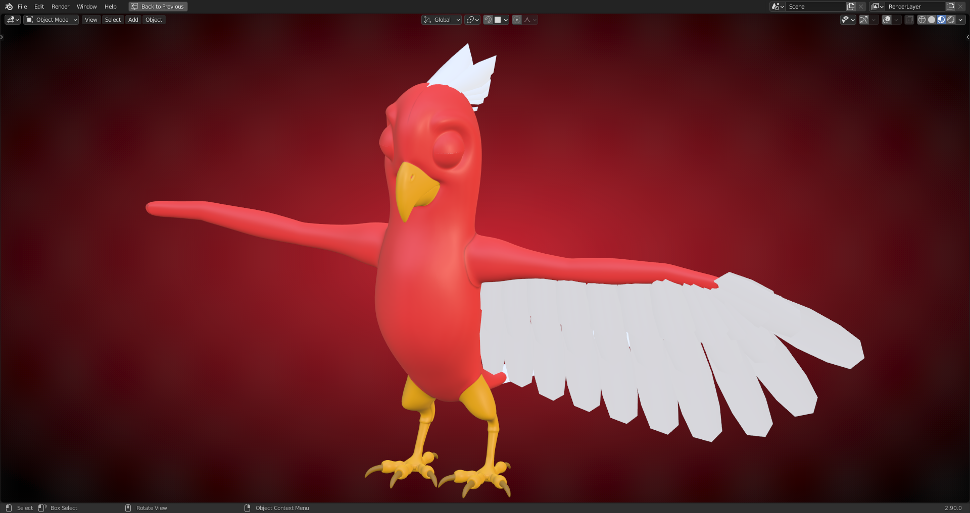
By the way: I did the last Screenshot directly with Blender's built-in "Save Screenshot" function and it shows me the colors as I see them in Blender 2.90. Doing this with my Blender 2.66.1 copy results in a darker image than what I can see directly in that Blender copy.
Switched to a blue-green "Background Gradient" for a better "Color Contrast":
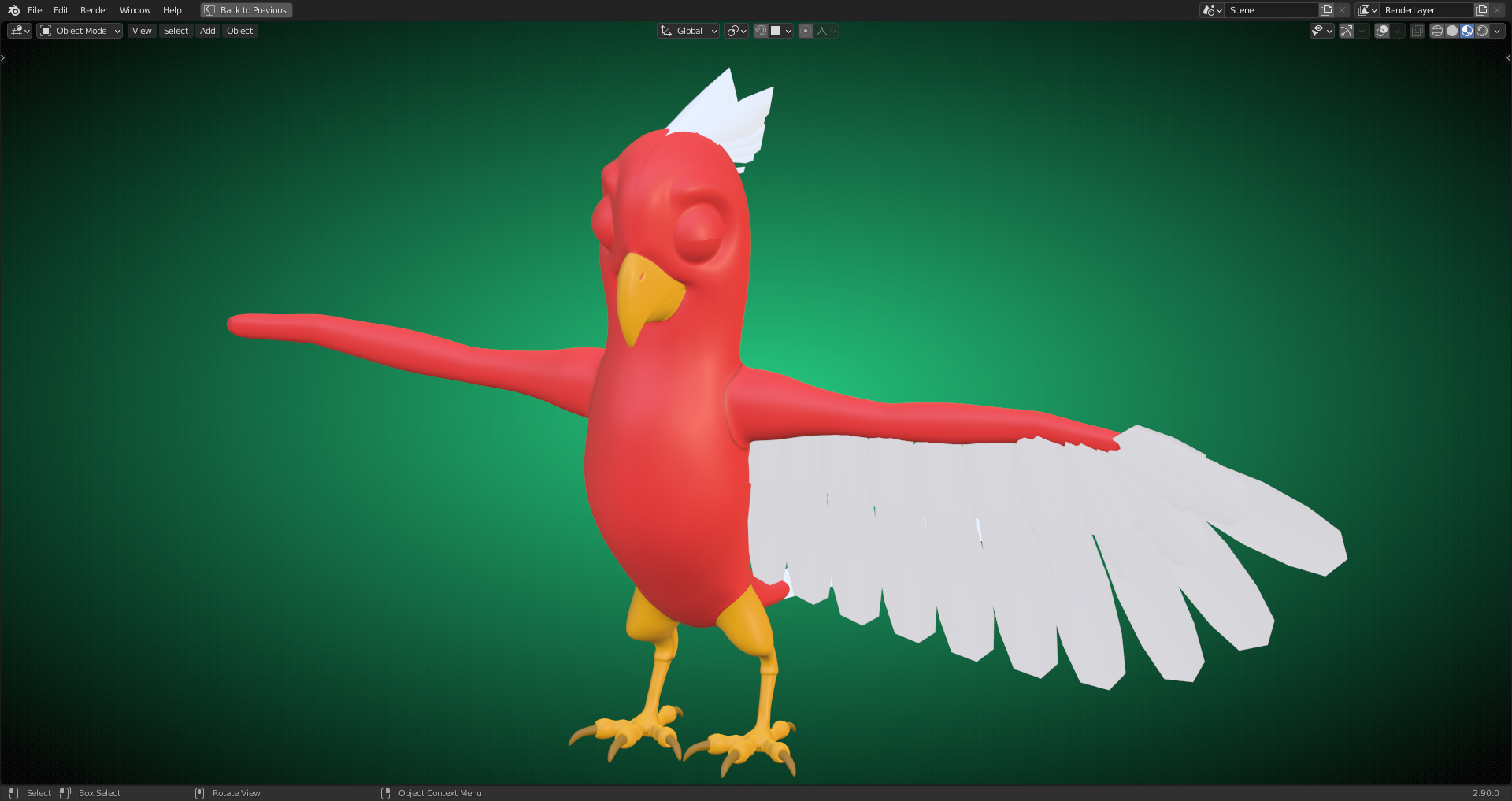
PS: I think I'll switch to Blender 2.90 for texture painting in order to get the colors right and return to Blender 2.66.1 for rigging since I want to try the "Bone Layer Management" addon. Or can Blender 2.90 offer at least a similar functionality for organizing "Bones"?
Smoothing the color transition at the beak and darkening the crevices around the beak and the eyelids:
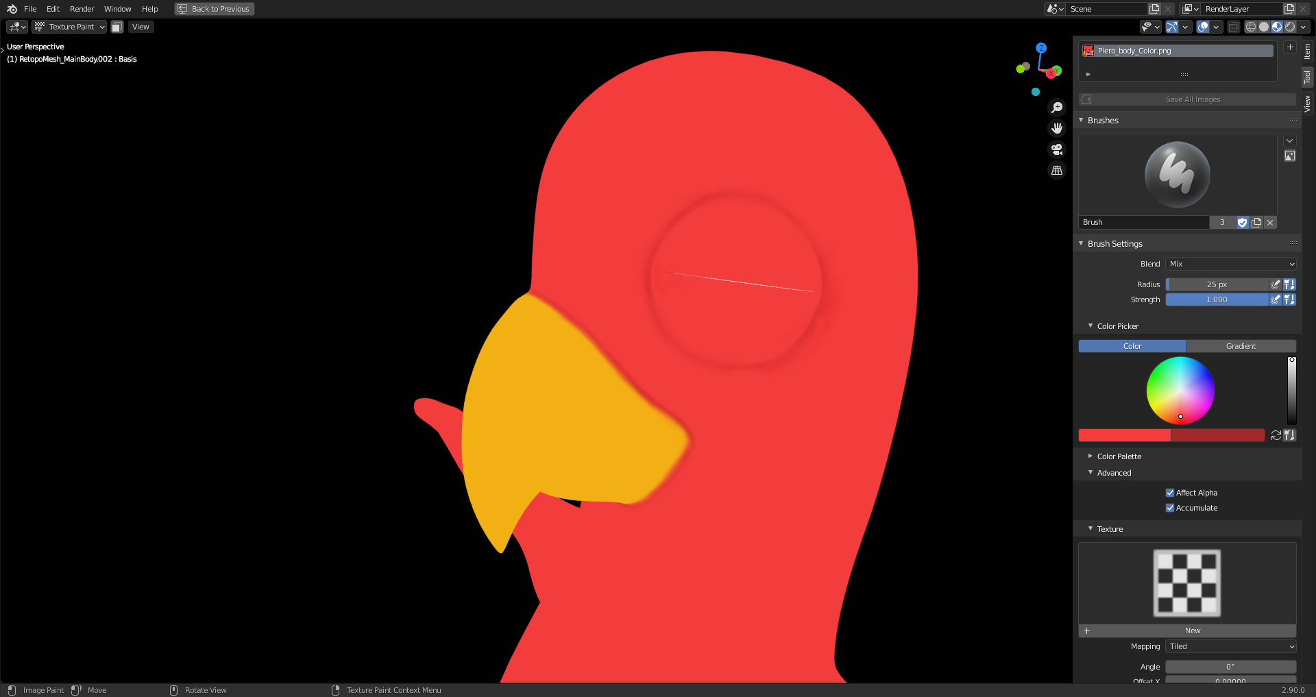
Texture painting in Blender can be tricky. You have to take care that you don't unitentionally hit other parts of your object with a bruch stroke. Also important: don't pack your "Mesh Islands" too dense in order to avoid "Color Bleeding" into other "Mesh Islands". One cool functionality in Blender is the possibility to define a "Second Brush Color" (just to the right of the color field where you define your "First Brush Color" (see first yellow frame in the image below) and to add the current "First Brush Color" to a "Color Palette" (see second yellow frame in the image below):
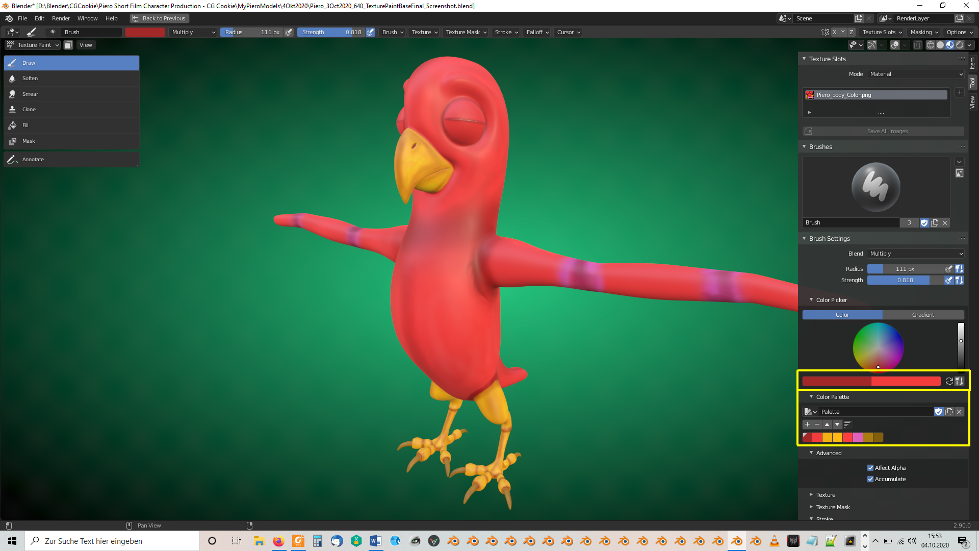
The "Second Brush Color" is used if you press CTRL while placing your brush strokes. You can also paint directly on your texture in the "UV Editor" but CTRL doesn't work there (at least in Blender 2.90) so that you need to reverse the "Brush Color Order" by pressing the button with the two arrows forming a circle just at the right of the two "Brush Color" fields.
I had to struggle a little bit with pixelated brush strokes but I think that this comes from "Mesh Islands" bleeding a color into another "Mesh Island". The "Soften Brush" can be very slow and sometimes the "Brush Circle" seems to stop at an invisible barrier (sometimes but not always in places where the mesh has a "UV Seam"). Maybe, there'ar settings to make the "3D Viewport" more responsive. You can also mark faces in "Edit Mode" and then press in "Texture Paint Mode" the "Paint Mask" button (yellow frame in the image below):
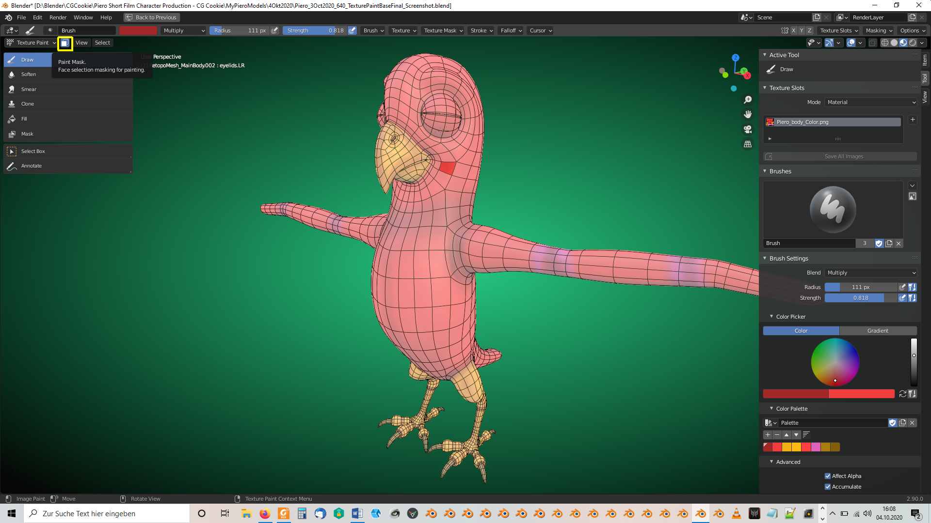
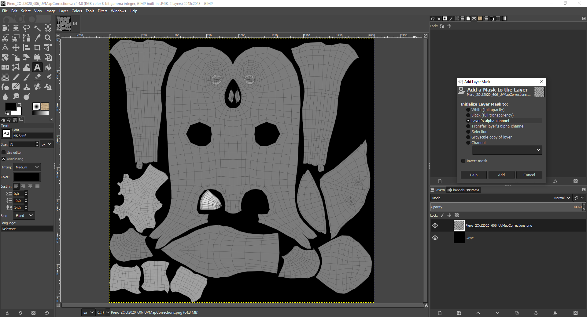
Your paint strokes now only affects the faces which you've marked in "Edit Mode". The "Wireframe Overlay" has to be switched on separately here (yellow frames):
