Not sure about the others... but for the Coppola, you could use the texture you already have... Just use it to create a Black/White version using your flags to isolate the text/design and then feed that into the height of a bump map and use the strength of the bump and/or the "black" and "white" color to adjust how strong the emboss is.
It may not be as much work as I'm making it out to be.
Part of getting it "right" would be me actually seeing the various logos, rather than just having flattish web images of them. I could definitely see making a logo embossed or glossy when it wasn't.
At some point I'll get back to this and improve a *few* things. Probably not too many. If I get back to it I'd really want to focus on some animations in it. I could spend months and months making sure each object in the store is perfect, and there's definitely a diminishing returns on that.
wardredauthor
The other downside to using real logos for everything, especially if I'm doing more than portfolio shot close ups, is catching the notice of Coppola, or Jack Daniels, or whoever. As just background there's definitely a fair use component to things. If they're in focus, at least in the animations, a lot of products are very particular about how their products are used. When I do get around to animating things, I'm going to have to be very careful about how I go about it so I don't get copyright takedowns or worse.
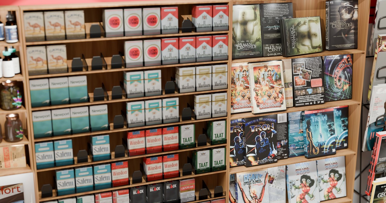
This is probably doubly true of the spoof products I have on the shelves. "Atomic Bombs" cereal from Fallout. "Booty Sweat" from Tropic Thunder. Sploosh, Slurm, I forget what other Easter eggs I put in there.
Well, maybe not doubly true. I'd probably have less fair use defense of using fake products on the shelves, but, at the same time, I'd be less likely to be sued by the creators of Futurama than Jack Daniels.
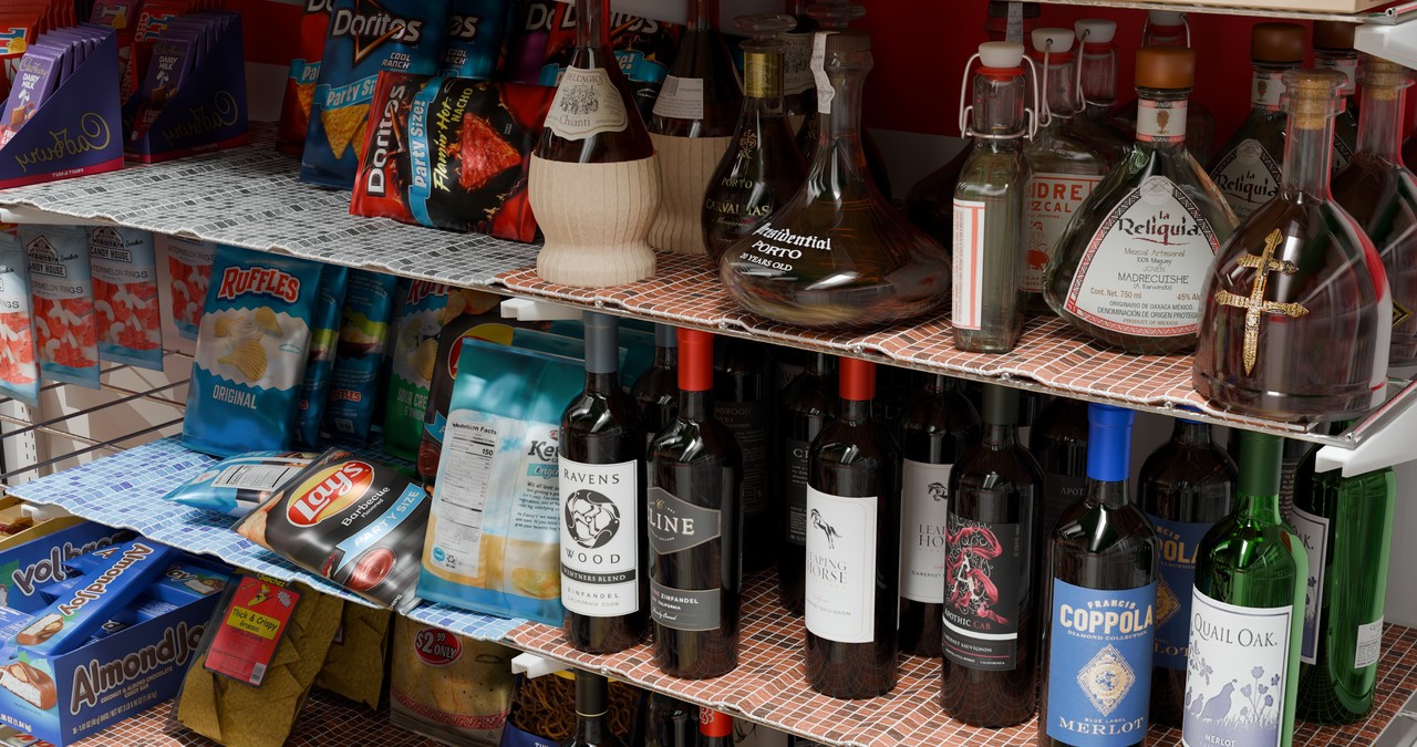
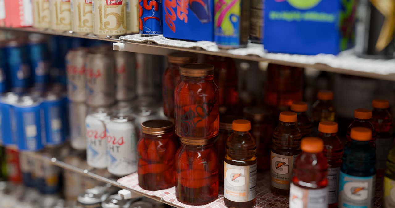
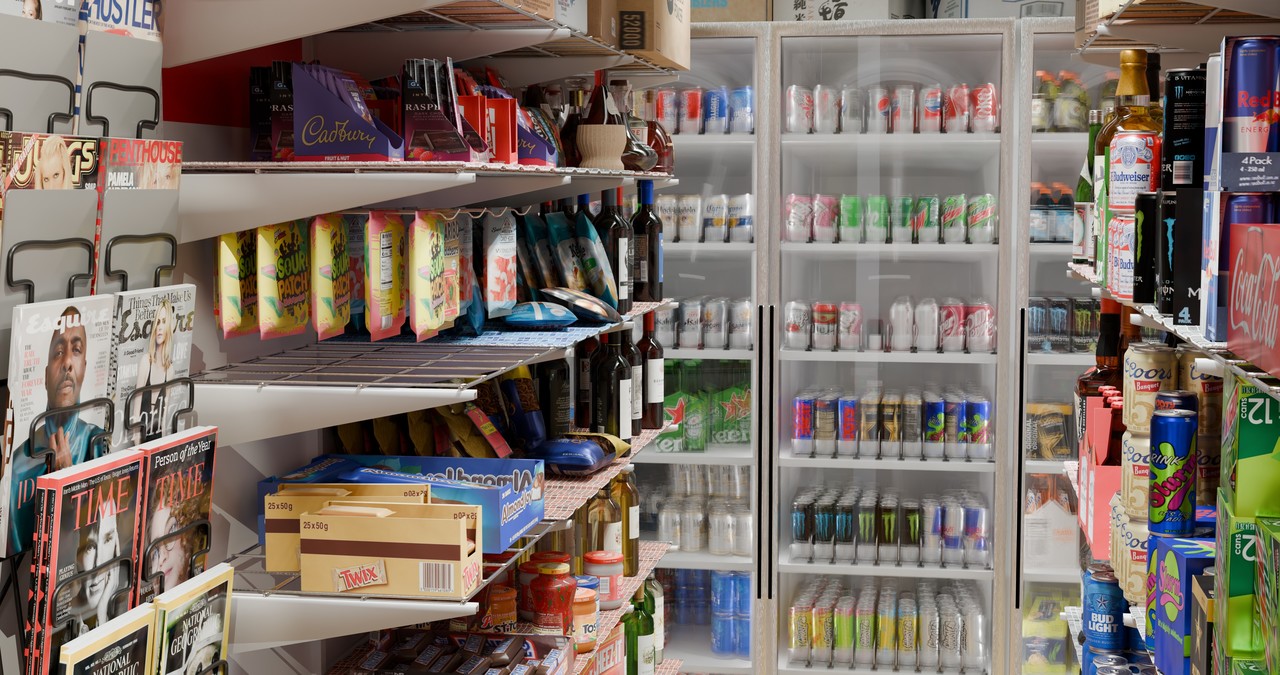
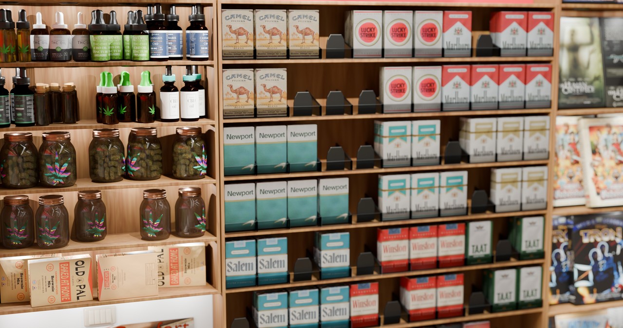
Overall, some fantastic images, Wardred! Only thing that gets me is that somehow either the reflects or the specular feels too even between all the things. For example, the chips I feel should be a bit more reflective and/or tighter specular. Simalarly the shaving cream cans (but maybe to a different extent). The cigarettes feel a bit flat. Keep in mind an unopened pack is usually wrapped in a cellophane wrapper, which from some angles will catch light reflections if I remember right. (I actually don't smoke, but I seem to remember seeing at least some reflections in packs before, even if I'm only really noticing the light reflections.) Magazines, esp at an angle, are usually different levels of glossy too. As for the wine, I know that some have foil lettering which can be quite a bit more glossy than the matte paper around it. I'm sure a quick trip to a store will bear out what I'm saying. If it wasn't for details like these, I'd almost think that this was a real photo!
Overall though, love the detail and think these are some great shots!
Great catches. Thank you for the feedback!
The cellophane or whatever wrap around the cigarettes, in particular, is always a bit crinkled. Your other observations are pretty much spot on too.
At some point I'd like to get back to the store, and to the Train Space Ship as a whole.
There's at least one commercial I'd like to run for Mi Mercado, and I'd love it as a set piece for slice of life bits on the train ship. . .
Alas, there's only one of me, and for the moment I'm focused on fleshing out the game I'm working on - Nether Plane.
I'm dubious of how realistic characters in this thing would have to be. I'm almost tempted to use it as a VFX prop instead whenever I get back to it. Though I've never personally done anything with Green Screen and that brings a whole host of its own issues. Matching the camera perspective, focal length, F-Stop, lighting in the store, etc.
wardredauthor
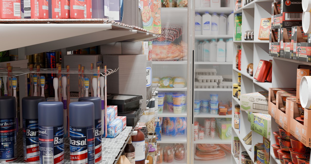
There are definitely bits of the store that got rushed. I forget how many hundreds of objects there are in the store, but I know the Almond Joy candy bar model could use some love, and some of the bags of chips aren't properly inflated. Their sides are to crisp instead of rounded - and I believe they're all inflated in the same way.
Grady Pruitt(gradyp)
I was hoping you'd understand what I was trying to say :D
Just as an example, I have 4 different bags of coffee sitting on my microwave. The packaging is more or less made with similar materials, but all 4 have different levels of glossiness. One is kind of matte, 2 you can definitely see light reflecting on them (though not quite to a mirror reflection) and the other is kind of in between. If I took a picture of all three side by side, you could clearly see exactly what I mean.
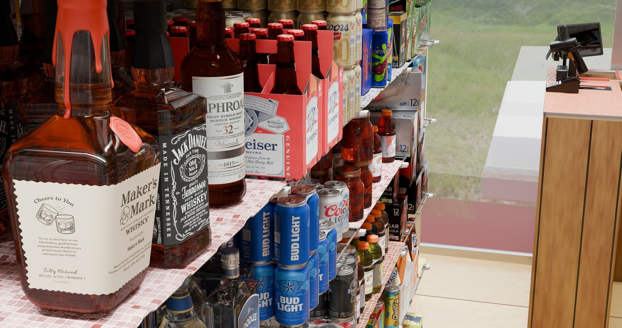
I was also thinking the cans, particulary the tin beer cans, should be a bit more reflective too. Most drink cans you can almost see a reflection of what's around you.
Grady Pruitt(gradyp)
Where you'll really notice the reflectivity I'm talking about isn't so much straight on as when you're looking at them from the side... that's where you can really see a difference not only between different brands, but sometimes even within the same brand.
Grady Pruitt(gradyp)
One other small detail... with the wine (and occasionally some other products), sometimes the lettering/design might be slightly embossed and stick up from the rest of the label around it, which you'll also notice in the way light is reflecting off it. I'm not sure about the others, but pretty sure that the Coppola is one that has the embossed labeling. That, plus the even-ness between all the different brands is what really makes that one feel flat to me.
wardredauthor
Most of the labels are definitely just 1 material at this point, and have no displacement or bump maps on them.
Given the time I'd love to trace out text and give it a bit more of a metallic look, or make a displacement map that makes it look embossed. I could see doing that for one or two "hero" labels, but I don't know that every label would get that treatment. My 2D skills are rudimentary. I know there are probably tools in Photoshop, which I don't have, that would make this easier. Without said tools it's a lot of hand tracery.
I'd also like to go back and fix a few janky things.
Other things, like upping the metallic and/or smoothness of an object, or getting the cellophane around the cigarette packs a. little more crinkled, seem more likely to get done en-mass when I revisit.
I like the Spanish title. That still looks so realistic. If you used depth of field and have that background be much more blurry, it'll practically look like a picture.


Not sure about the others... but for the Coppola, you could use the texture you already have... Just use it to create a Black/White version using your flags to isolate the text/design and then feed that into the height of a bump map and use the strength of the bump and/or the "black" and "white" color to adjust how strong the emboss is.
It may not be as much work as I'm making it out to be.
Part of getting it "right" would be me actually seeing the various logos, rather than just having flattish web images of them. I could definitely see making a logo embossed or glossy when it wasn't.
At some point I'll get back to this and improve a *few* things. Probably not too many. If I get back to it I'd really want to focus on some animations in it. I could spend months and months making sure each object in the store is perfect, and there's definitely a diminishing returns on that.
The other downside to using real logos for everything, especially if I'm doing more than portfolio shot close ups, is catching the notice of Coppola, or Jack Daniels, or whoever. As just background there's definitely a fair use component to things. If they're in focus, at least in the animations, a lot of products are very particular about how their products are used. When I do get around to animating things, I'm going to have to be very careful about how I go about it so I don't get copyright takedowns or worse.
This is probably doubly true of the spoof products I have on the shelves. "Atomic Bombs" cereal from Fallout. "Booty Sweat" from Tropic Thunder. Sploosh, Slurm, I forget what other Easter eggs I put in there.
Well, maybe not doubly true. I'd probably have less fair use defense of using fake products on the shelves, but, at the same time, I'd be less likely to be sued by the creators of Futurama than Jack Daniels.
Overall, some fantastic images, Wardred! Only thing that gets me is that somehow either the reflects or the specular feels too even between all the things. For example, the chips I feel should be a bit more reflective and/or tighter specular. Simalarly the shaving cream cans (but maybe to a different extent). The cigarettes feel a bit flat. Keep in mind an unopened pack is usually wrapped in a cellophane wrapper, which from some angles will catch light reflections if I remember right. (I actually don't smoke, but I seem to remember seeing at least some reflections in packs before, even if I'm only really noticing the light reflections.) Magazines, esp at an angle, are usually different levels of glossy too. As for the wine, I know that some have foil lettering which can be quite a bit more glossy than the matte paper around it. I'm sure a quick trip to a store will bear out what I'm saying. If it wasn't for details like these, I'd almost think that this was a real photo!
Overall though, love the detail and think these are some great shots!
Great catches. Thank you for the feedback!
The cellophane or whatever wrap around the cigarettes, in particular, is always a bit crinkled. Your other observations are pretty much spot on too.
At some point I'd like to get back to the store, and to the Train Space Ship as a whole.
There's at least one commercial I'd like to run for Mi Mercado, and I'd love it as a set piece for slice of life bits on the train ship. . .
Alas, there's only one of me, and for the moment I'm focused on fleshing out the game I'm working on - Nether Plane.
I'm dubious of how realistic characters in this thing would have to be. I'm almost tempted to use it as a VFX prop instead whenever I get back to it. Though I've never personally done anything with Green Screen and that brings a whole host of its own issues. Matching the camera perspective, focal length, F-Stop, lighting in the store, etc.
There are definitely bits of the store that got rushed. I forget how many hundreds of objects there are in the store, but I know the Almond Joy candy bar model could use some love, and some of the bags of chips aren't properly inflated. Their sides are to crisp instead of rounded - and I believe they're all inflated in the same way.
I was hoping you'd understand what I was trying to say :D
Just as an example, I have 4 different bags of coffee sitting on my microwave. The packaging is more or less made with similar materials, but all 4 have different levels of glossiness. One is kind of matte, 2 you can definitely see light reflecting on them (though not quite to a mirror reflection) and the other is kind of in between. If I took a picture of all three side by side, you could clearly see exactly what I mean.
I was also thinking the cans, particulary the tin beer cans, should be a bit more reflective too. Most drink cans you can almost see a reflection of what's around you.
Where you'll really notice the reflectivity I'm talking about isn't so much straight on as when you're looking at them from the side... that's where you can really see a difference not only between different brands, but sometimes even within the same brand.
One other small detail... with the wine (and occasionally some other products), sometimes the lettering/design might be slightly embossed and stick up from the rest of the label around it, which you'll also notice in the way light is reflecting off it. I'm not sure about the others, but pretty sure that the Coppola is one that has the embossed labeling. That, plus the even-ness between all the different brands is what really makes that one feel flat to me.
Most of the labels are definitely just 1 material at this point, and have no displacement or bump maps on them.
Given the time I'd love to trace out text and give it a bit more of a metallic look, or make a displacement map that makes it look embossed. I could see doing that for one or two "hero" labels, but I don't know that every label would get that treatment. My 2D skills are rudimentary. I know there are probably tools in Photoshop, which I don't have, that would make this easier. Without said tools it's a lot of hand tracery.
I'd also like to go back and fix a few janky things.
Other things, like upping the metallic and/or smoothness of an object, or getting the cellophane around the cigarette packs a. little more crinkled, seem more likely to get done en-mass when I revisit.
So much work!
I like the Spanish title. That still looks so realistic. If you used depth of field and have that background be much more blurry, it'll practically look like a picture.