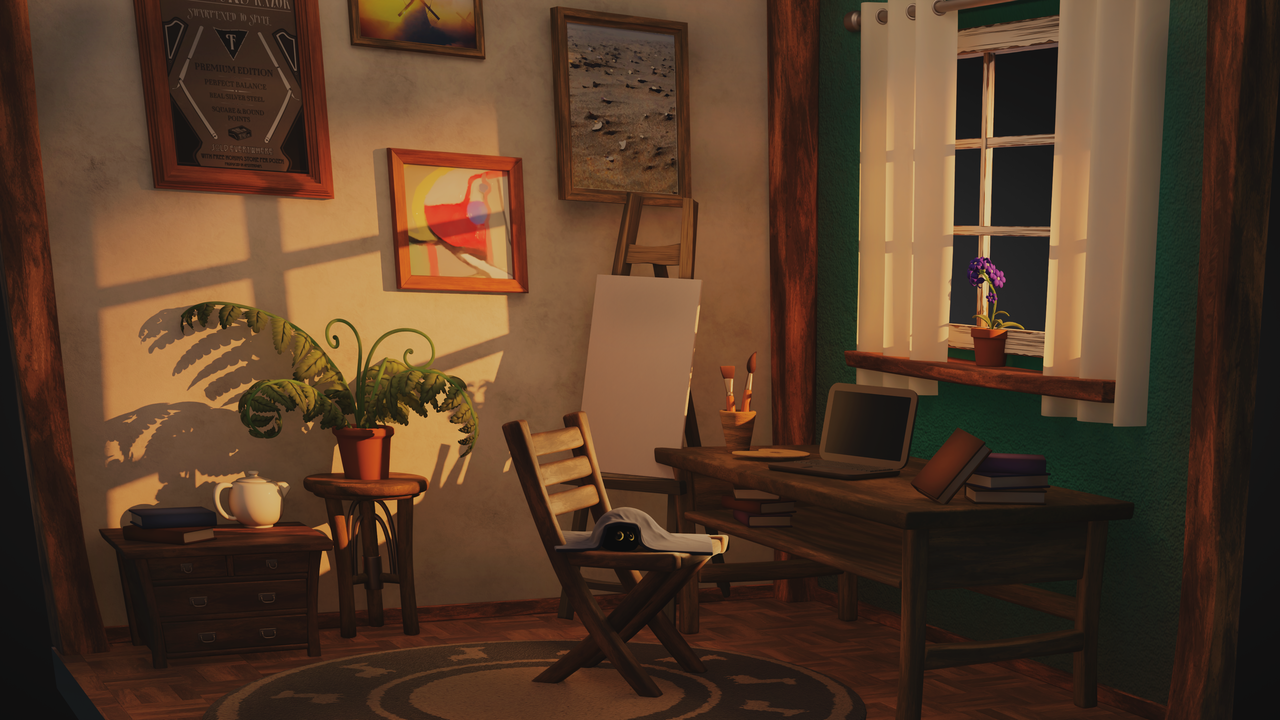
Went back to the drawing board on my first attempt at this scene. Started from scratch. Really focused on finding a better camera angle which helped make the atmosphere align with the emotion and story I wanted to tell. Spent more time on lighting and object placement than I had before. I'm satisfied that this is telling a better story and has more depth, color, and emotion.
What I really like about this one is that it feels lived in.. not just like a showroom piece. You can almost get a sense of the person who lives in this space.
The two things that pop off to me is that there's a few books where we can see the cover or spine of a book, but they're blank. With the way other things are detailed throughout the room, that makes this really obvious. Even if you gave it a "fake" book title (like a "book never written type of thing or something you just completely make up), I think that would make those blend in a bit better. The other thing that bugs me is that compared to the desk and chair and other things, that little chest with books and the teapot (? I think?) on the left of the screen feels out of proportion. The drawers on it seem like they'd hardly hold anything. I'd either make the drawers bigger or do without the drawers altogether and make it more of a table. It looks to me like if it's supposed to hold clothes, it would hardly hold anything (which, if that's what it's supposed to be, it would be a LOT bigger).
Other than those two things, I'd say great job!
homely
It definitely is an improvement. The lighting is better, the room is larger and there's more assets in the scene, making it feel more alive. Nicely done.