
Why is having a Color Palette and Color Schemes Important?
Firstly, I would highly recommend creating your own swatch palette and take the colors from nature, existing art, photos, and color references, then compile them into your own working palette. That way you become more familiar with those colors and given an example of how to use them.
I choose every single color by doing this and I can tell you where each of the color groups were from originally. The more you become familiar with color and how they interact with each other, the higher quality and correlation of art you will then produce in turn. Okay, so I have been asked before if it would be alright to use my color palette they see from my tutorials or screenshots, and I found it funny that I was asked permission since I don't own the colors in any way.
I have just organized them in a way that makes it more convenient and readily available for me when I am digitally painting. I then realized during my next piece how much I go back and fourth between the palette and the canvas and how important and valuable I consider this palette to be. So after a weeded out all the extra swatches that were floating in the palette I now have this clean color swatch collection in groups of ten. So for every ten colors a new set is available. For every piece don't assume you have to rely on your palette, it should be ever-growing and ever-evolving.
Why don't you use the standard light to dark hue selections?
Instead of the standard sets of an individual hue, like lining red up from it's lightest value to darkest is because I find that overly simplistic and uninviting to new possibilities in your work. I like to shift not only in lightness but in the hue range as well.
his may spark new and interesting color plays and you are given more options and a broader outlook if your seeing a color shift you may not have done so originally. For the image on the banner you can see how I take a dark blue/green and transition into orange. This is an example of a coloring hue shift. I also don't organize the colors in any fashion for I like going to the palette originally looking for a specific color and then completely finding another that catches my eye.
↓ I tend to use the First Twenty repeatedly for characters and below I give a quick explanation of what I use them for ↓
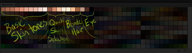
I believe when it comes to something like this that there is organization in chaos but I will highlight certain sections of the swatch palette for those who like to keep it a been more tidy
Here are some warmer swatch hues:

And here are some of the cooler swatch hues:

I can't stress enough how important color is. If you are looking to really delve into color theory and learn more, I would recommend the book, Color and Light: A Guide for the Realist Painter by James Gurney.


Get this download and 285 others by joining CG Cookie
