@ mention jlampel
@jlampel
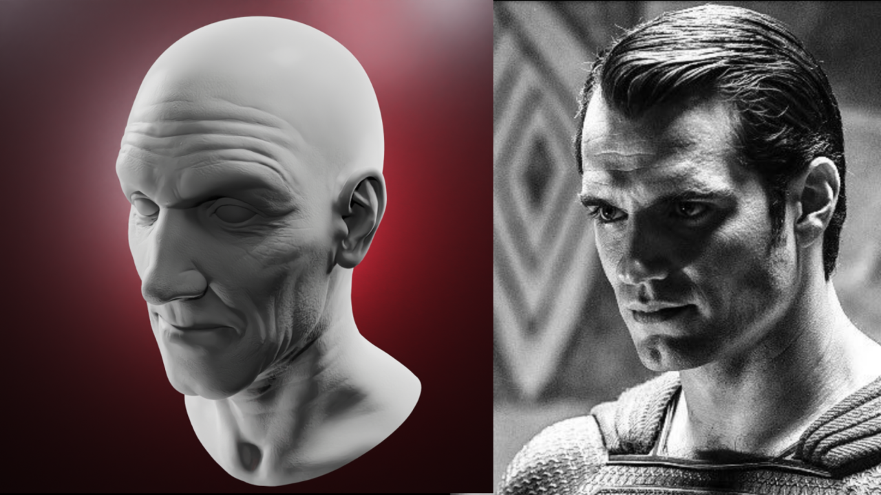
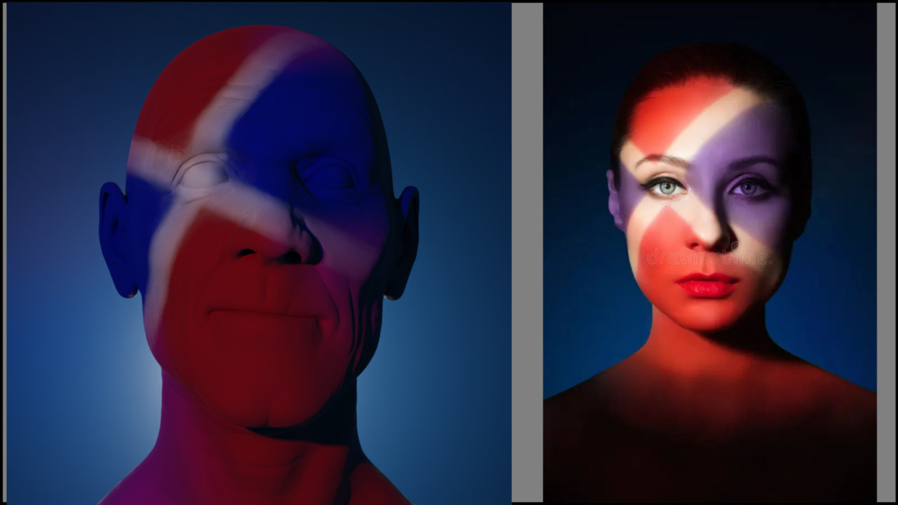
These are my submissions with their reference for the Digital Lighting final assignment. I will also send this link to the submissions post.
As I understand the exercise, this was strictly a lighting exercise and not to modify the head model itself.
The goal was to attempt to capture the lighting, shadows, colors and the mood or feeling of the reference.
The references chosen are not fan based but I found to be a lighting challenge I found from noticing them in the past of how and why they did the lighting that way and just coming across them on the internet and found them to be a challenge to attempt with y basic newly acquired understanding and skill (if one would call it that 8^]).
Superman
I found the lighting and his intense look would be challenging to try and capture
Went through several iterations and a lot of tweaking of the lights to try and maintain the balance I first achieved but as I progressed it was an ever-increasing exercise going around and around tweaking and examining each lights impact, it was a challenge to maintain a balance and not to completely have the head completely washed out. I used a variation of values of the colors to try an diminish that and keep shadows to convey the intensity. I also found that because of the bald head the large area caught a lot of light making it challenging it getting the shadows where I wanted them. I hope it turned ut ok, from my perspective it was the best I could achieve without spending a lot more time on it (similar for the others)
Doc Brown
I chose this reference to just simply capture the lighting, shadows and coloring, the perplexed look or mood I didn’t know how or if I would be I would be able to capture through lighting. I wasn’t able to match the skin tone colors as I’d like to have, maybe with more experience I will be able to do it. I’m not sure if would have to add some modifications to the model to achieve matching the colors rather than trying to do it strictly by the lighting. But overall, I found I was able to get a reasonably good skin tone and getting the shadows approximately around the same areas as the reference.
The Fantriot
I chose this refence due to the lighting challenge. I was thinking that the photographer might have used makeup to achieve the look but I’m not sure about that. I wanted to attempt to recreated a divided lighting as well as the cross across the face.
I made the colors bold to represent the character. The character is a passionate and bold in their love of their sports team or country. People would either call them fanatic or patriot but the colors shine from their passion.
Captain Kirk
Since I was a kid watching the show I always found the way they lit up his eye was odd and fascinating. I first thought of doing this just due to highlighting the eyes and try and make it look natural. It was a little more difficult than I thought and this is as close as I could come without spending days, weeks or years trying to do it. 8^]
I also tried to capture/convey with the background the mood/intensity of the battle station lighting and the yellow to red alert frame of mind and situation a starship captain has be ever vigilant in encountering and dealing with life and death situations
I think I will submit the Fantriot in the submission part as this one is unique and more bold.
This was an excellent course and learned a lot.


