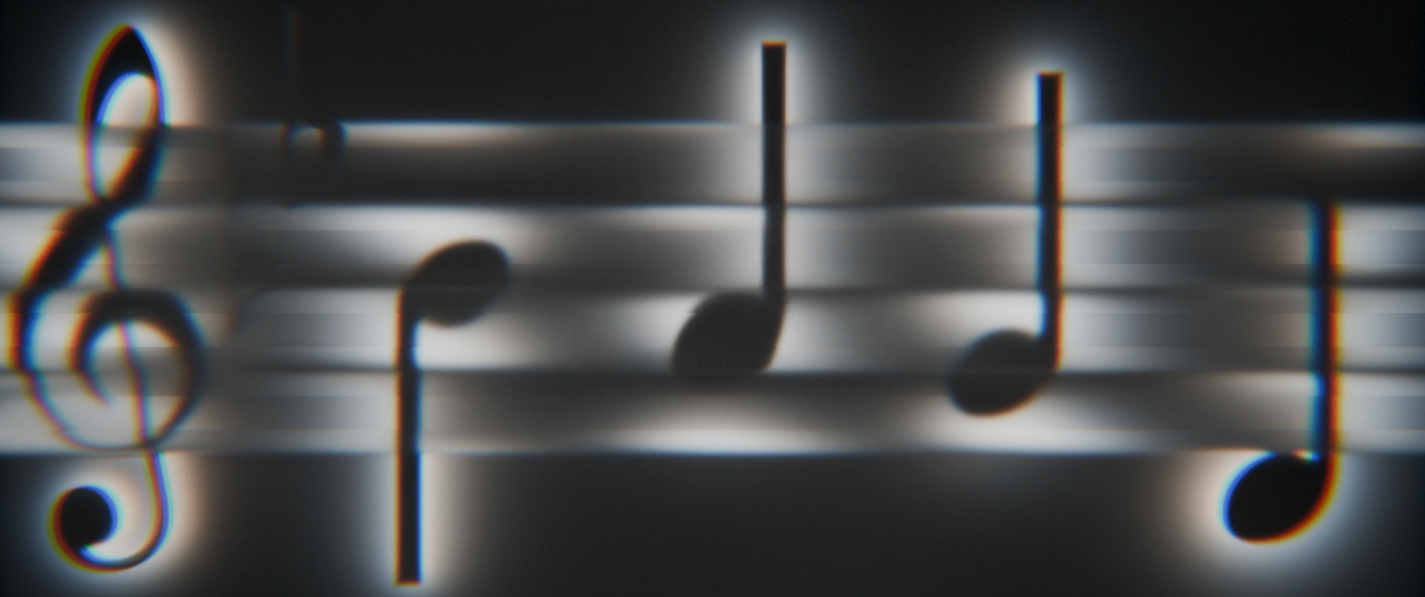
This was my submission to the first Session from the new Sessions Type course.
I know we were supposed to use Typography, but I took some liberties. At the end of the day it's still a font: Noto Music from Google Fonts. And music is a language of its own, so... here we are.
I've been learning the Piano and when following the Blurred Lines prompt this little animation came to mind.
The measure we see on screen is the actual measure we hear repeating for most of the audio track. Which also happens to be my piano practice recording.
The song is called Lux Aeterna, and I thought it would be well fitting for the moody vibe that these blurred lines, noisy visuals bring. The light source is behind the type. A little unlike the video lessons, I chose to reveal the type more like shadows/silhouettes rather than as the emissive material itself.
The glass forms the musical staff instead of covering the entire frame.
I also love black and white compositions, so it was hard to add color in the end. Which do you prefer? Color or grayscale?
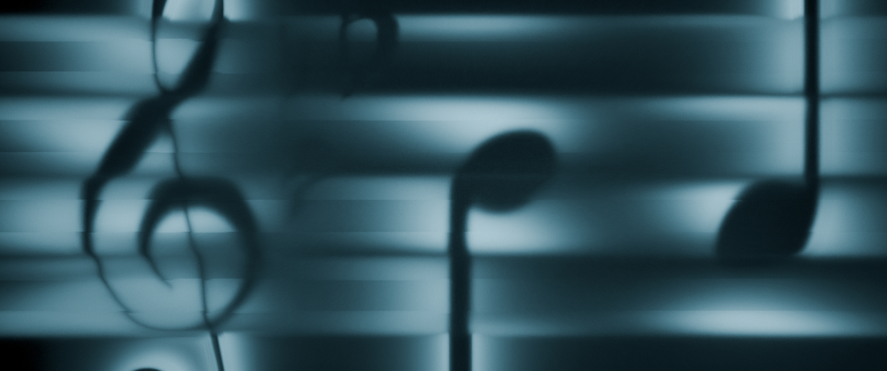
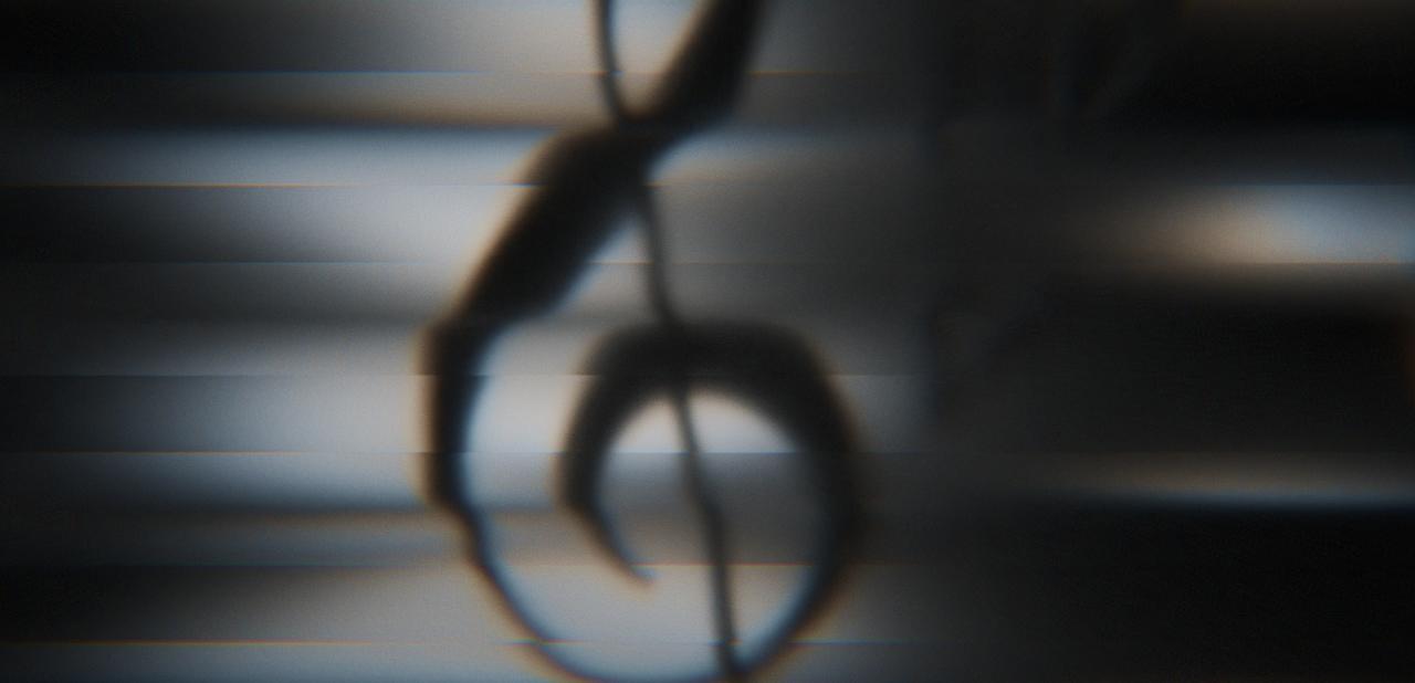
I prefer grayscale. I also prefer one of those little music notes in specific, the one that is almost an S. I also prefer the strong chromatic aberration over stuff that has none, so I'm glad it's in.
I love chromatic aberration!! Whenever I have the chance to use it in a stronger way than what realism asks for I go for it. The 80s noisy style was definitely one of them.
Thanks Omar. I think I too prefer the grayscale. And I'm with you... I love the treble clef symbol!! I also prefer eighth notes vs the quarter notes, but alas, this measure was all quarter notes. 🤷🏻♀️
It's great to create and imagine, I trust you! Well done, Nathi!!
Thanks Claire :)
Cool, you are !! (humor Star Wars)